Skip to content

Color problems rarely arrive with a warning label. A lab dip can look right, the first bulk roll can look acceptable, and the finished dress can still reveal a warmer sleeve, a slightly darker skirt panel, or a lining that changes the whole color impression. In fast-moving women’s fashion, those differences matter because customers compare adjacent panels, coordinated sets, campaign photography, and repeat orders side by side. The challenge is that shade variation is not controlled by the color name alone. Hue, depth, fiber chemistry, fabric structure, dye formulation, finishing, light, surface direction, and cutting discipline all influence what the eye finally sees.
Fabric color affects shade variation because different hues, shade depths, fibers, dye combinations, and surface structures respond differently to dyeing and light. Deep shades can be sensitive to dye build-up and undertone control, while pale neutrals may reveal tiny temperature shifts. The same approved color can also look different on satin, chiffon, mesh, lace, lining, and trims, so bulk approval must consider the finished garment, not only one swatch.
A practical example makes this easier to picture. Imagine a burgundy occasion dress with a satin body, stretch mesh upper panel, lining, invisible zipper, and matching thread. Every component can be called ‘burgundy’ on the bill of materials, yet five slightly different burgundies may appear once the garment is assembled. The useful question is therefore not whether variation can happen; it is whether the development and production system identifies the risk early enough to keep a manageable textile difference from becoming an obvious garment defect. The sections below follow that problem from fabric inspection through repeat production.
What Is Fabric Shade Variation?
Fabric shade variation is a visible or measurable color difference between fabric areas, rolls, dye lots, garment panels, or finished garments that are intended to match. The difference may involve lightness, hue, chroma, or undertone. In bulk apparel production, the key issue is not whether a difference exists, but whether it exceeds the approved tolerance or becomes noticeable in the finished garment.
| Variation Type | Where It Appears | Typical Garment Risk | Practical Control Point |
| Dye-lot variation | Between dyeing batches | Repeat or split production looks different | Record and approve each dye lot |
| Roll-to-roll variation | Between fabric rolls | Garments from different rolls do not match | Compare rolls before cutting |
| Side-center-side | Across fabric width | Panels cut from different zones vary | Check full usable width |
| End-to-end variation | Along roll length | Early and late bundles may differ | Check multiple points along the roll |
| Panel-to-panel variation | Within one garment | Sleeve, bodice, skirt, or facing mismatch | Keep compatible shade groups together |
| Garment-to-garment variation | Across finished pieces | Same SKU looks inconsistent at retail | Final shade review by color batch |
What Shade Variation Looks Like
Shade variation is rarely as simple as one piece being darker than another. In real production, a shade can move in several directions at once. A black fabric may remain equally dark yet look slightly brown. Navy may drift toward violet. Champagne may become more yellow, while dusty pink can lose its muted character and look brighter or grayer. These changes are often subtle when swatches are viewed separately, but they become much easier to detect when two panels are stitched together and the eye can compare them directly.
A useful working vocabulary separates color into lightness, hue, and chroma. Lightness describes whether the shade moves lighter or darker. Hue describes a directional shift toward red, blue, yellow, green, or another color family. Chroma describes how vivid or muted the shade appears. This is why an experienced color comment sounds more specific than ‘not right.’ Comments such as ‘slightly too blue and a little dull’ or ‘correct depth but too warm’ give the dyeing team a practical correction direction and create a clearer approval record for later bulk comparison.
Where Shade Variation Happens
The location of a shade difference often gives useful clues about its cause. Roll-to-roll variation appears between separate rolls. Dye-lot variation appears between separately processed batches. Side-center-side variation occurs across the width, while end-to-end or running shade changes along the length. Once those materials enter the cutting room, the same textile differences can turn into panel-to-panel or garment-to-garment variation. Identifying the type matters because the corrective action for a uniform but different roll is not the same as the action for a single roll that changes continuously along its length.
Garment construction amplifies risk. A small difference between two rolls may be acceptable if each garment is cut entirely from one compatible shade group. The same material can look poor if a front panel is cut from one roll and a sleeve or back panel from another. Matching sets are equally sensitive because a top and skirt are worn together, and plain fabrics usually reveal variation more clearly than busy prints. Shade inspection therefore needs to connect with marker planning, bundle control, and sewing traceability rather than ending at the fabric inspection table.
Is Every Difference a Defect?
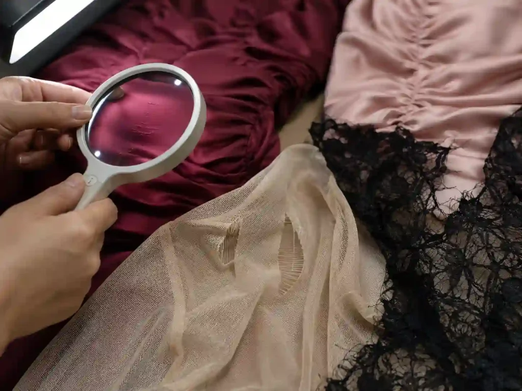
Not every measurable difference is automatically a defect. Textile color is produced by physical materials and chemical processes, so some variation is normal even under controlled conditions. The commercial question is whether the difference exceeds the agreed standard or becomes objectionable in the finished product. A tiny difference between two garments sold separately may have little visual impact, while the same difference between adjacent satin bodice panels can be immediately noticeable because the eye compares both surfaces at the same time.
This is also why color tolerance should not be copied blindly from one product to another. A smooth, solid, premium occasion dress typically exposes shade variation more clearly than a washed casual style with deliberate surface variation. The viewing area, fabric gloss, garment structure, retail positioning, and customer expectation all change the practical tolerance. A reliable approval process defines the physical reference, viewing condition, and decision method before bulk production starts. Without that reference, different people may compare against a Pantone page, an old swatch, a phone image, or memory and reach completely different conclusions.
How Variation Reaches Garments
The cutting room is one of the most underestimated parts of color control. Even if the dyehouse produces material that is broadly within specification, careless roll mixing can turn modest textile variation into an obvious garment mismatch. Consider three navy rolls that are all usable but not perfectly identical. If garment components stay within compatible shade groups, finished pieces may look consistent. If front, back, sleeve, waistband, and facing parts are mixed randomly, the same acceptable fabric can create visibly different areas within one garment.
Direction-sensitive materials add another layer. Satin, velvet, brushed fabrics, and some sequined surfaces can reflect light differently depending on grain, nap, or surface orientation. Two panels from the same roll may appear to be different shades if one is reversed. This is not always a dyeing defect; it can be a cutting-direction problem. For color-sensitive fashion styles, the more useful production question is whether the approved shade remains visually consistent through spreading, cutting, sewing, pressing, and finished-garment inspection, not merely whether the incoming roll passed a single swatch check.
Which Fabric Colors Show More Shade Variation?
No color family is always the most difficult. Deep shades can be sensitive to dye build-up and undertone control, pale neutrals can reveal very small warm-cool shifts, and highly saturated colors may expose minor hue or chroma changes. The practical shade risk depends on the color family, dye recipe, fiber, surface, finishing process, and how closely materials or garment panels are viewed together.
| Color Group | Common Shade Risk | What the Eye Often Notices First | Typical Apparel Situation |
| Black / Navy | Undertone and depth shift | Blue, red, or brown cast | Eveningwear, bodycon, tailoring |
| Burgundy / Chocolate | Red-brown balance | Warm-cool direction | Occasion dresses, satin styles |
| Ivory / Champagne | Yellow-pink shift | Temperature change | Eventwear, light neutrals |
| Beige / Gray | Green-red or warm-cool shift | Undertone | Minimal neutral collections |
| Dusty Pink / Mauve | Gray-red-purple balance | Loss of muted character | Seasonal feminine collections |
| Red / Fuchsia | Hue and saturation | Orange-blue or dull-bright shift | Party and clubwear |
| Emerald / Royal Blue | Hue purity and depth | Yellow-blue direction | Statement fashion colors |
Dark Colors
Black, navy, chocolate, burgundy, forest green, and other deep shades often deserve tighter process attention because high color depth can be sensitive to dye concentration, temperature, time, pH, pretreatment, and finishing. The important issue is not merely darkness. Deep colors also carry undertones. One black may look blue, another brown, and another red. Navy can lean violet, while burgundy can move toward brick, brown, or purple. Those differences become especially visible when the shell, lining, zipper tape, and thread are made from different materials but are expected to read as one color.
Dark colors can also be misleading under weak or warm lighting. Two blacks that look nearly identical in a cutting room may separate under daylight or campaign photography. That does not mean every dark shade is unstable. A well-controlled recipe on a consistent substrate can reproduce very closely. The better conclusion is that deep colors should be judged for undertone, levelness, batch repeatability, and light behavior rather than approved only because they are ‘dark enough.’ For repeat styles, retaining a physical bulk swatch from the first accepted production is much more useful than relying on a generic color name.
Pale and Neutral Colors
Ivory, champagne, nude, beige, stone, pale gray, dusty pink, and muted mauve can look deceptively easy because they require less apparent color depth, yet they often have a narrow visual comfort zone. A champagne satin shifting slightly toward yellow can feel warmer and less refined, while a small pink shift may change how it coordinates with accessories or lining. Dusty colors are similarly sensitive because their character depends on a careful balance between the main hue and the gray component that softens it.
Neutral shades are also strongly affected by lighting and surrounding colors. Gray may appear balanced in one environment and slightly green or red in another. Ivory may look clean in daylight but too yellow under warm indoor light. For coordinated collections, the challenge increases when satin, chiffon, mesh, lace, and lining must share the same color story. Those materials do not need identical instrument readings, but they must look intentionally related when worn together. This is why pale shades should be reviewed with the real substrate and supporting components, not only as isolated paper references or digital screen colors.
Bright and Saturated Colors
Red, fuchsia, cobalt, royal blue, emerald, and orange tend to make hue or saturation errors obvious. A red can remain strong yet move slightly toward orange, creating a different visual message from a red that moves toward blue. Emerald may become too yellow and appear grassy, while a blue shift can push it toward teal. Fuchsia can lose intensity and look dull even when its lightness remains close to the target. In trend-driven fashion, these changes matter because a saturated color often serves as the visual anchor of the style or seasonal color story.
Complex formulations can add sensitivity because several colorants must remain balanced. If one component responds differently to a substrate or processing change, the final shade can shift in a particular direction. Corrections need care for the same reason; repeatedly adding colorants to fix one issue can create a new undertone or increase metamerism risk. Practical comments should therefore describe the direction of the difference. ‘Too orange,’ ‘slightly too blue,’ or ‘less saturated than the approved swatch’ is far more useful than ‘wrong color’ because it gives the mill and apparel team a shared language for correction.
Color Depth and Tolerance
There is no universal rule that one Delta E limit or one visual tolerance fits every light, medium, and deep shade. Brands commonly define acceptance according to the product category, material, color family, surface, visual adjacency, and their own quality expectations. A solid satin evening dress exposes very small differences because large smooth panels reflect light clearly. A textured crepe or washed casual garment may visually absorb a similar numerical difference. The acceptance system must therefore connect instrument data with what the finished product actually looks like.
A practical risk review asks three questions. First, how easy is it for the eye to notice a small shift in this particular color family? Second, will different materials or panels sit directly beside each other? Third, will the product be photographed or sold under lighting that emphasizes the difference? Those questions are more useful than ranking colors from easy to difficult. They also help explain why a technically close neutral can still be commercially wrong, while a slightly larger measured difference in a textured surface may remain visually acceptable.
How Does Fabric Type Change the Same Color?
The same target color can look different on different fabrics because fiber chemistry affects dye response, while weave, knit structure, transparency, texture, and gloss change how light reaches the eye. A Pantone target can remain the creative reference, but satin, chiffon, mesh, lace, jersey, lining, and trims usually need material-specific color approval rather than assuming one formula will look identical across every substrate.
Fiber and Dye Affinity
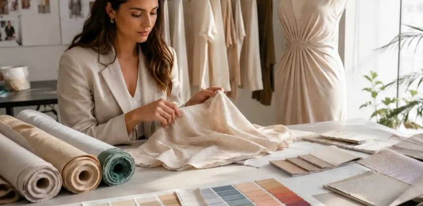
A fabric is not a neutral surface onto which color is simply painted. Polyester, nylon, cotton, rayon, and other fibers interact with different dye classes and processing conditions. Even when two materials are developed to look similar under one light, their spectral reflectance can differ because the fibers and dyes are not identical. This is especially relevant in women’s fashion, where one dress may combine polyester satin, nylon-rich stretch mesh, polyester lining, elastic, and sewing thread from another material system. Each component can be called the same color while responding differently under changing light.
Construction changes the visual result too. Dense woven fabric can appear deeper because more colored surface is presented to the eye. Open mesh allows skin or lining to influence the apparent shade. Knit loops create tiny areas of shadow, while textured crepe scatters light differently from a smooth filament satin. This is why experienced product teams do not ask a mill to copy one dye recipe across fundamentally different substrates. The practical goal is a coordinated finished appearance under agreed viewing conditions, with each material developed and approved according to how it will actually be used in the garment.
Satin, Chiffon, and Mesh
Satin is one of the most visually sensitive fabrics because its smooth surface reflects directional light. A panel can look lighter when it catches a highlight and deeper when viewed from another angle. Cutting direction matters for the same reason. If one satin panel is reversed while another follows the intended grain direction, the reflected light can create a strong apparent shade difference even when both came from the same roll. Fitted dresses with large uninterrupted panels make this effect particularly obvious, so shade inspection and cutting direction have to work together.
Chiffon and mesh behave differently because transparency becomes part of the color. A single chiffon layer may look pale, while several overlapping layers appear much deeper. The lining underneath can shift the entire garment warmer or cooler. Stretch mesh changes again when it is placed on the body; as the structure opens, more skin or lining becomes visible and the shade can look lighter. For these materials, color approval works best when the swatch is reviewed in the same condition in which it will be worn: chiffon over the intended lining, mesh both relaxed and moderately stretched, and satin aligned in the correct direction.
Lace and Textured Fabrics
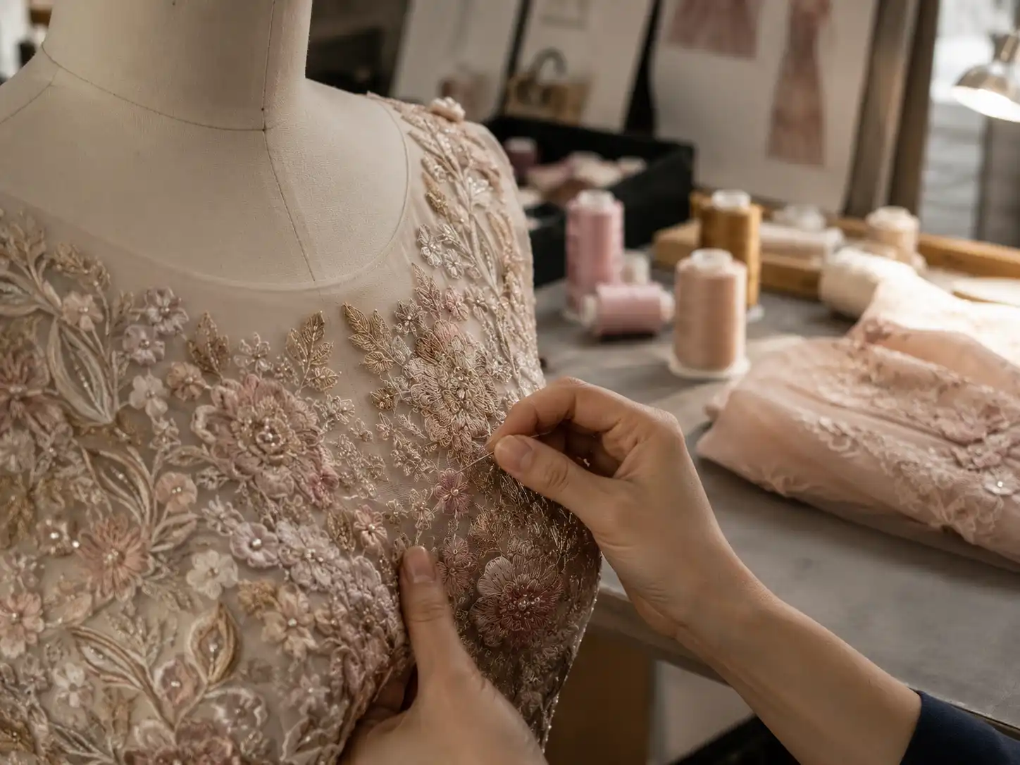
Lace is difficult to judge because the eye sees both the lace yarn and the surface behind the open areas. A lace that looks ideal on white paper can appear completely different once placed over nude, champagne, black, or matching-color lining. Embroidery density adds another variable because heavily stitched areas contain more yarn and may look darker or richer than open areas. If the ground and embroidery use different fibers, they may also accept dyes differently and show a greater mismatch under certain lighting conditions.
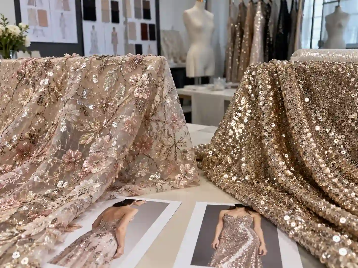
Velvet and pile fabrics add strong directional behavior. When the nap points one way, light is reflected differently than when the same fabric is turned around, which can create dramatic light-dark changes without a true dye difference. Sequined materials combine dyed substrate color with reflective decorative surfaces, so sequin density, orientation, and finish all influence the final impression. These fabrics should be evaluated as finished visual surfaces rather than as simple color chips. A good approval photograph may include several viewing angles, but the physical swatch and actual material assembly remain the more reliable references.
Linings, Trims, and Threads
The shell fabric can pass color approval and the garment can still look wrong if supporting components do not coordinate. Lining, zipper tape, thread, elastic, binding, lace trim, hooks, buttons, and decorative materials may come from different suppliers and different fiber systems. A lining mismatch may be invisible under opaque crepe but completely change a chiffon or mesh dress. Sewing thread can become unexpectedly prominent on smooth satin because the stitch line catches light, while a zipper tape with the wrong undertone can remain visible even when the zipper itself is designed to be concealed.
A practical garment-level color file therefore records more than one generic shade name. It can include the main fabric, lining, mesh or lace, zipper, sewing thread, elastic, and visible trim color references, plus the approved relationship between them. The goal is not to force every component to have identical spectral data; different surfaces naturally interact with light in different ways. The goal is visual harmony in the finished garment. That distinction becomes particularly important for occasionwear and party styles that combine sheer, glossy, matte, and textured materials in one color story.
How Do Dye Lots Create Shade Variation?
A dye lot is a batch of fabric processed together during one dyeing run. A later batch is a new production event, even when the recipe and color target remain the same. Small differences in greige fabric, water, dye concentration, pH, temperature, time, machine loading, or finishing can shift the shade, so dye lots and fabric rolls should remain identifiable through bulk approval, cutting, and repeat production.
How Dye Lots Differ
A repeat dyeing run is a reproduction process, not a literal continuation of the original batch. Even when the same recipe is used, the physical conditions may not be perfectly identical. The greige fabric can come from another production batch, pretreatment can alter absorbency, water chemistry may move slightly, and machine loading can change circulation. Temperature rise, holding time, pH, chemical additions, and finishing also introduce variables. Each difference may be small, yet several small differences can combine into a visible shift in lightness, hue, or chroma.
This becomes especially important when a brand repeats a color months later. The original dye lot may no longer exist, and the mill is effectively reproducing an approved shade on new material under a new production run. Historical data makes that process more controlled, but it does not remove the need for renewed checking. A useful repeat file includes an approved physical swatch, previous bulk reference, fabric specification, and any notes about the direction of earlier corrections. The credible goal is repeatability through documentation and comparison, not a promise that two separate dyeing events will automatically be visually identical.
Roll-to-Roll Differences
Several rolls in the same order can be broadly acceptable while still showing modest differences. One may be slightly deeper, another warmer, and another closer to the approved standard. If those differences remain within the brand’s agreed tolerance, the fabric may still be usable, but it needs controlled allocation. Problems begin when rolls are mixed randomly. A bodycon dress with multi-piece fronts, sleeves, and a back yoke provides many adjacent surfaces, so even a small roll difference can become obvious if garment components are cut from incompatible shades.
Shade sorting prevents this by grouping rolls or roll sections according to their visual or measured similarity before cutting. The cutting team then keeps panels within compatible groups and maintains bundle identity through sewing. This is much more efficient than finding a mismatch during final inspection, when fabric has already been cut, stitched, trimmed, pressed, and packed. For large programs with several colors, roll identification should be treated like size and style identification: it is production information that needs to remain traceable instead of disappearing once the fabric leaves incoming inspection.
Variation Within One Roll
A roll number does not prove that the entire roll is perfectly uniform. End-to-end variation can develop when color changes gradually along the length, while side-center-side variation appears across the width. A practical inspection therefore looks beyond one small cutting from the roll head. For color-sensitive solid fabrics, teams may compare the left, center, and right areas and review several points along the roll. The exact inspection plan varies with risk, but the principle is that one swatch cannot represent a large quantity of fabric when running or widthwise shade is suspected.
If variation is detected, marker planning may need to change. Certain areas can be restricted, shade zones can be separated, or garment parts can be allocated so that visible components stay within compatible material. This is particularly important for plain satin, smooth jersey, and other surfaces where the eye sees color continuously. Shade information must remain connected to the fabric as it moves through spreading and cutting. Once roll and zone identities are lost, the team may be unable to explain why a particular sleeve or skirt panel looks different from the rest of the garment.
Repeat Orders
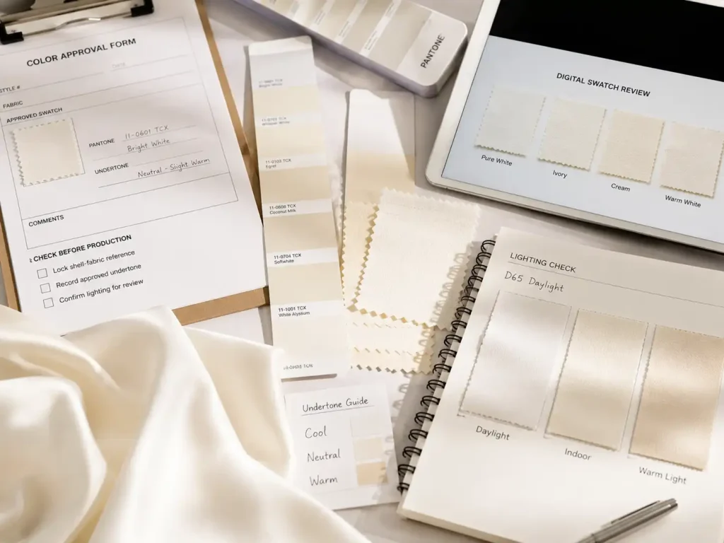
Repeat production is where disciplined record keeping becomes commercially valuable. A style number by itself is not enough to reproduce a previous order. Useful references include the approved color name, Pantone target when used, lab dip, approved fabric swatch, previous bulk fabric, supplier specification, dye-lot record, lining color, zipper and thread color, color approval photos, Golden sample, and notes about any bulk issues. Those records allow a new lot to be compared with what was actually accepted rather than with a memory of the color.
If the original fabric is still available, repeat color development is usually more straightforward. If the supplier changes, the substrate is discontinued, or a replacement fabric is introduced, the project needs renewed assessment because composition, weight, surface, stretch, transparency, and finishing can all change the perceived shade. Jinfeng Apparel’s documented repeat-order process keeps fabric and color records, including approved swatches, bulk color and dye-lot information, so later production can be checked against previous references. The useful promise to a fashion brand is controlled comparison and traceability, not the unrealistic claim that new dye lots can never differ.
How Is Fabric Shade Variation Measured?
Fabric shade variation is measured with controlled visual assessment and, where appropriate, instrumental color measurement. A spectrophotometer can express color numerically and calculate Delta E between a sample and standard, while visual review shows how the material actually looks on the fabric surface. Lighting must also be controlled because two materials can match under one illuminant and separate under another, a behavior known as metamerism.
| Item | Typical Reference | What It Tells the Team | Important Limitation |
| D65 daylight simulator | Approx. 6500 K | Daylight-oriented visual comparison | Not the same as every real daylight condition |
| Illuminant A | Approx. 2856 K | Warm tungsten-like comparison | Much warmer than many modern retail LEDs |
| TL84 reference | Approx. 4000 K class | Traditional retail fluorescent comparison | Actual store spectra vary |
| CIELAB L* | 0 = black, 100 = diffuse white reference scale | Lightness direction | Surface effects can still influence perception |
| CIELAB a* | Negative = green, positive = red | Red-green direction | Not a standalone pass/fail value |
| CIELAB b* | Negative = blue, positive = yellow | Blue-yellow direction | Must be read with the other coordinates |
| Delta E / ΔE00 | Calculated difference value | Overall distance from approved standard | No universal apparel pass threshold |
Lab Dip and Bulk Approval
A lab dip is a small dyed sample prepared during color development so the proposed shade can be compared with the required standard before full-scale dyeing. It answers an early question: has the mill reached an acceptable color direction on the selected substrate? Once a lab dip is approved, it becomes part of the reference chain, but it does not automatically prove that bulk fabric will be identical. Laboratory and production-scale conditions differ, and bulk fabric still needs its own approval before cutting.
A practical sequence is Color Standard -> Lab Dip -> Approved Swatch -> Bulk Fabric -> Finished Garment. Each stage solves a different problem. The original standard defines the target, the lab dip demonstrates a workable formulation, bulk approval confirms production-scale reproduction, and garment review checks whether the color still looks right after lining, sewing, pressing, and assembly. Where physical swatches are available, they are especially useful because screen displays and phone photographs can change with camera settings, white balance, display calibration, ambient light, and image compression. The physical reference anchors the conversation in the actual material.
Delta E and Spectrophotometers
A spectrophotometer measures the light reflected from a material and converts the result into standardized color coordinates. In apparel work, CIELAB values are commonly discussed as L*, a*, and b*: L* represents lightness, a* describes the red-green axis, and b* describes the yellow-blue axis. Color-difference formulas then calculate how far a sample sits from a reference. Delta E, written as ΔE, is the general term used for that calculated difference, and CIEDE2000, often written ΔE00, is widely used for evaluating small color differences more in line with visual perception.
The number is useful because phrases such as ‘a little off’ are subjective, but Delta E is not a universal pass-fail button. Tolerance depends on the brand, formula used, material, color family, product construction, and visual sensitivity of the application. A small difference between hidden lining pieces may have little commercial effect, while a similar numerical difference between adjacent satin panels can be unacceptable. Instrument data therefore supports a decision rather than replacing it. When a garment obviously looks mismatched, a narrowly passing number should trigger investigation into sampling location, gloss, direction, metamerism, or component interaction rather than ending the discussion.
Light Sources and Metamerism
A fabric does not have one unchanging visual appearance independent of light. We see the wavelengths reflected from the textile under a particular light source, so changing the source can change the relationship between two samples. Two fabrics may appear to match in daylight and separate under warm indoor light, or match in a factory light booth and look different in retail lighting. That behavior is called metamerism, and it is particularly important when different fibers or dye systems are being matched in the same garment.
For fashion products, several viewing conditions may matter because the garment moves through the factory, photo studio, daylight, retail environment, and the customer’s home. D65 is a commonly used daylight simulator with a correlated color temperature around 6500 K, while Illuminant A represents a warm tungsten-like source at about 2856 K. TL84 is widely used as a retail fluorescent reference in textile color work, although actual store lighting varies greatly today. The goal is not to test under every possible lamp but to agree on relevant conditions and make sure critical material combinations do not fall apart visually when the light changes.
Visual Assessment Still Matters
Instrument measurement is powerful, but the customer finally sees a garment rather than a measurement report. Reflective, transparent, textured, and direction-sensitive fabrics can behave in ways that a small flat measurement area does not fully describe. Satin changes with viewing angle, chiffon changes when layered, mesh changes when stretched, and velvet changes with nap direction. A skilled visual assessment under controlled lighting captures those real product effects and helps determine whether a measured difference is noticeable in the application that matters.
A strong decision process combines a defined physical standard, controlled lighting, instrument measurement where appropriate, side-by-side visual review, actual fabric construction, adjacent component comparison, and final garment appearance. Problems often arise when teams remove one of those pieces. Relying entirely on memory and photographs introduces uncontrolled viewing conditions, while relying entirely on a numerical limit can ignore gloss, texture, direction, and adjacency. Color approval works best when the technical data and experienced visual judgment point in the same direction and when any disagreement is investigated before bulk cutting rather than after garments are finished.
How Can Shade Variation Be Controlled in Bulk Production?
Shade variation is controlled most effectively as a production chain, not as a final inspection task. The process begins with a clear color standard, continues through lab dip and bulk approval, keeps dye lots and rolls traceable, separates meaningful shade groups before cutting, maintains bundle identity during sewing, and checks finished garments against approved references. The aim is to stop manageable fabric differences from becoming visible garment inconsistencies.
Color Approval Before Bulk
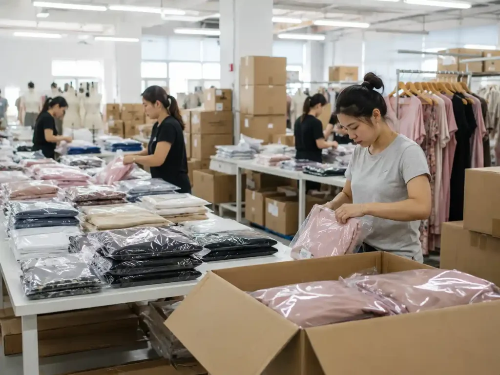
Color control starts with clarity. Names such as wine red, champagne, nude, sage, or dark green are useful for merchandising but too broad to function as complete production standards. The project should identify the actual approval reference, which may be a Pantone target, physical fabric swatch, original garment, brand master standard, or approved lab dip. If several references exist, the team needs to know which one takes priority. That decision prevents a common production argument in which each person is comparing the bulk fabric with a different idea of the target.
The intended substrate should be confirmed at the same time. A Pantone reference can guide the creative direction, but the color needs approval on the actual material because gloss, transparency, texture, and fiber composition change appearance. Multi-fabric styles may require relational matching rather than mathematically identical results. A chiffon shell, satin trim, and lining can be visually coordinated even though the three substrates do not produce identical spectral curves. Jinfeng Apparel’s documented color review process checks items such as Pantone reference, physical color standard, lab dip, fabric swatch, lighting condition, fabric batch, dye lot, surface shine, lining color, and bulk approval before production decisions are finalized.
Bulk Fabric and Cutting Control
Once bulk fabric arrives, shade management becomes a production-control task. Incoming material should remain identifiable by supplier batch, dye lot, roll, and approval status. Color-sensitive orders benefit from roll-to-roll comparison and additional widthwise or lengthwise checks when variation is suspected. Rolls that differ meaningfully should be grouped rather than mixed indiscriminately. The objective is not to reject every small difference; it is to understand the available shade population before markers are laid and irreversible cutting begins.
Cutting discipline is critical because shade separation must survive spreading and bundling. Direction-sensitive materials also require consistent orientation. Satin, velvet, brushed textiles, and some sequined surfaces can appear different when panels are reversed, even if the dye itself is uniform. Bundle IDs should remain clear through sewing so a later shade question can be traced back to the roll or shade group used. In Jinfeng Apparel’s documented QC workflow, color control is linked with fabric batch records, lab dip or swatch approval, fabric inspection, dye-lot separation, lining color matching, bulk color approval, and repeat-order fabric records rather than being treated as an isolated final check.
Multi-Fabric Garments
Complex women’s fashion often combines several materials in one color story. An evening dress may contain satin, mesh, lining, zipper tape, sewing thread, cups, lace, boning channels, elastic, and decorative trims. A matching set can use one surface for the top and another for the skirt. Approving those components individually does not guarantee that they will look coherent together. Color development should therefore include combination review, particularly for sheer materials and reflective surfaces where the supporting layer or viewing angle changes the final appearance.
The most useful review is simple and physical: main fabric with lining, main fabric with mesh, main fabric with lace, main fabric with zipper and thread, and then the complete group together. Chiffon should be viewed over the intended lining, stretch mesh should be checked both relaxed and under realistic extension, and satin should be viewed from more than one angle while maintaining the intended grain direction. Discovering that champagne chiffon becomes too pink over the chosen lining during development is an easy correction. Discovering the same thing after thousands of garments have been sewn can become a costly rework, delivery, and merchandising problem.
Repeat-Order Shade Control
Repeat orders are often treated as easier because pattern, fit, and construction have already been approved, but color still introduces fresh variables. The first step is to retrieve the physical and technical references from the earlier order: approved swatch, previous bulk fabric, dye-lot information, fabric specification, lining and trim colors, Golden sample, and any issue notes. New material is then compared against what was actually accepted before. If the original supplier or fabric changes, the replacement should be treated as a new color-development variable rather than assumed to reproduce the old result automatically.
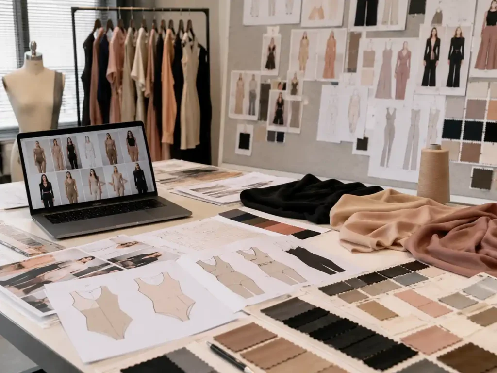
The same principle applies when a bestselling style is expanded into new colors. Moving from black to ivory or pink to red is not merely an SKU change. Opacity, lining, zipper, thread, photography behavior, dyeing minimums, and bulk approval can all change. Over time, an organized color history becomes a valuable working library for seasonal collections and replenishment. For brands that need repeatable custom dresses across multiple drops, this is also a practical point to discuss with a manufacturing partner: what physical references are retained, how new dye lots are compared, and how color records remain connected to QC and bulk production rather than living only in email or chat history.
Conclusion
Fabric color influences shade variation, but it never acts alone. The color family, shade depth, fiber, construction, dye lot, roll, surface reflection, lighting, lining, trims, and cutting direction all shape what the finished garment looks like. Strong color control therefore works as a chain of evidence: a clear target, material-specific development, approved lab dip or swatch, bulk verification, roll and dye-lot traceability, controlled cutting, component matching, and repeat-order records. When those links stay connected, shade variation becomes a manageable production variable rather than a surprise discovered after garments are sewn. For custom women’s fashion programs using satin, mesh, chiffon, lace, sequins, or multiple coordinated materials, discussing color standards and repeat-order expectations early with the manufacturing team can prevent many of the most expensive color problems later in the production calendar.