Skip to content

A black dress and an ivory dress can come from the same base fabric, follow the same pattern, and carry almost the same nominal weight, yet behave very differently once they are worn. The ivory version may reveal underwear, seam allowances, pocket bags, bra cups, or the line where a lining ends, while the black version looks comfortably covered. That contrast is a reminder that transparency is not simply a question of whether a fabric is thin or thick. It is a visual performance issue created by the interaction of color, construction, body contrast, light, stretch, and garment engineering. For fashion teams, the mistake is usually not choosing a light color; it is assuming that approval in one colorway proves that every other colorway will perform the same way. The most expensive transparency problems are rarely discovered on the swatch card. They tend to appear later, when a fitted sample is photographed in daylight, when an ivory bulk lot reaches the cutting room, or when customers wear the finished garment in conditions the development team never reproduced.
Fabric color affects perceived transparency because color changes how light is absorbed, reflected, and contrasted against whatever sits behind the textile. Dark shades often mask underlying details more effectively, while white, ivory, cream, and pastels can make skin, underwear, seams, or linings easier to see. Color is only one variable, however; density, GSM, yarn structure, stretch, finish, lighting, lining, and fit can be equally important.
That distinction becomes especially important in women’s fashion, where a fabric is rarely used as a flat, relaxed sheet. It may be stretched across the hip in a bodycon dress, gathered through the waist, doubled at a seam, layered over cups or boning, photographed with flash, or placed over a lining in a slightly different tone. Experienced development teams therefore evaluate transparency as a garment-level property rather than a single fabric specification. Once that habit is adopted, many familiar problems – the white dress that suddenly needs lining, the pale jersey that turns sheer at the seat, or the champagne satin that shows every seam allowance – become much easier to predict before bulk production begins.
How Does Fabric Color Affect Transparency?
Fabric color changes transparency mainly by altering how the textile absorbs and reflects light and how strongly the background contrasts with the fabric. Dark shades often reduce visible show-through, while pale shades tend to expose underlying details more easily. The final result still depends on fabric density, yarn spacing, stretch, surface finish, lighting, lining, and the amount of tension created by the garment.
Light Interaction
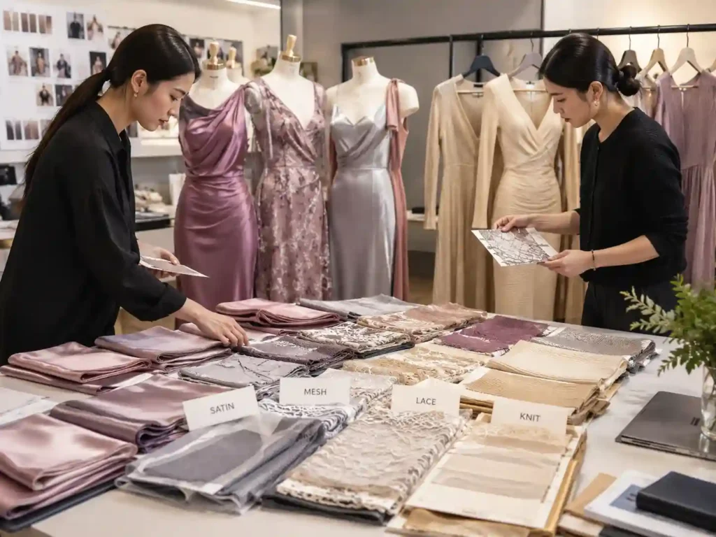
When light reaches a textile, three things happen at the same time: some light reflects from the surface, some is absorbed by the fibers and dye, and some passes through or around the yarn structure. Our eyes combine those signals and interpret the result as opaque, translucent, or sheer. Dark dyes typically absorb more visible light, so a black or navy version of a fabric often hides the contrast underneath better than white or ivory. Pale colors reflect more light, but brightness should not be confused with coverage. A white jersey can look bright from the front while still allowing the outline of underwear, skin, or an inner construction layer to influence what the viewer sees.
The important limitation is structural: dye cannot close the physical spaces in a fabric. Black power mesh remains mesh, dark chiffon remains lightweight chiffon, and a loose knit can still reveal the body when the loops open under tension. Color modifies the optical impression created by the textile, while the weave, knit, yarn diameter, and density determine how much physical material actually occupies the surface. That is why transparency problems are best diagnosed by asking whether the issue comes from color contrast, insufficient surface coverage, stretch, or garment construction instead of assuming that a darker shade will solve every form of see-through.
Physical vs. Visual Opacity
Physical light transmission and visual show-through are closely related, but they are not the same thing. A fabric can let some light pass through without clearly revealing the shape beneath it. Another fabric can have decent overall coverage yet make a dark pocket bag, zipper tape, bra cup, or seam allowance easy to identify because those components create high contrast behind the shell. This is why opacity assessment often compares a textile over contrasting backgrounds. The test is not only asking how much light passes through; it is asking how much information about the background remains visible after the textile is placed over it.
For apparel, a useful distinction is between four levels of transparency: physical openness in the construction, optical transmission through the material, visual show-through of objects beneath the fabric, and garment transparency after the textile has been cut, sewn, stretched, lined, pressed, and worn. The final level matters most commercially because customers do not judge a dress as a laboratory swatch. They see it while standing, walking, sitting, turning, or posing for photographs under changing light. A fabric that looks acceptable over a hand in the sample room can perform differently across the bust or seat once garment tension and body contrast are added.
Color Is One Variable
A common sourcing shortcut is to describe a requirement as something like “200 GSM white jersey” and assume the number defines coverage. It does not. Two fabrics at the same nominal GSM can distribute their mass in very different ways. One may use fine yarns packed into a compact construction, while another may use thicker yarns with larger spaces between loops. The first can provide much stronger opacity even though both appear identical on a basic specification sheet. The same logic explains why an ivory ponte may be more opaque than a much darker lightweight mesh: construction can outweigh color when the physical surface coverage is fundamentally different.
In practical fabric approval, color should be reviewed together with composition, weight, stretch, recovery, hand feel, drape, construction, surface finish, and intended fit. That combined approach is also reflected in Jinfeng Apparel’s development workflow, where fabric changes are reassessed for weight, stretch, hand feel, drape, transparency, color, cost, lead time, and possible lining or pattern impact before they are carried forward. The point is not to make approval complicated for its own sake. It is to prevent a single attractive color swatch from hiding a performance problem that becomes obvious only after the garment is assembled and worn.
| Variable | Typical Influence | Practical Check |
| Color depth | Darker shades often mask background contrast more effectively | Compare pale and dark colorways over the same backing |
| Fabric density | Higher surface coverage usually reduces physical show-through | Inspect yarn spacing and construction, not GSM alone |
| Stretch | Can open knit loops and reduce effective coverage | Check fabric at realistic garment tension |
| Lighting | Backlight can expose details hidden indoors | Review indoor light, daylight, and backlight where relevant |
| Background contrast | Changes how clearly skin, underwear, or lining is seen | Use white, black, neutral, and proposed lining backings |
| Layering | Adds coverage but can change drape and fit | Evaluate shell and lining as a system |
Color in Real Garments
The most useful transparency question is rarely “Is this fabric sheer?” A better question is “Where will this color become sheer in this specific garment?” White and ivory dresses often reveal seam allowances because doubled seam areas sit beside single-layer panels, creating a visible tonal difference. Pale satin can expose zipper tape, facing edges, bra cups, or the line where a lining stops. Stretch jersey may look fine through the waist but become noticeably more transparent at the high hip because the fabric is under greater tension there. Each issue comes from a different interaction between material, color, pattern, and construction.
That garment-level view also prevents overcorrection. Not every hint of translucency is a defect. Chiffon, mesh, lace, tulle, and organza often use controlled transparency as part of the design. The job is to distinguish intentional sheer zones from accidental exposure. An unlined sleeve may be exactly what the designer wants, while visible underwear through the seat panel is usually not. Once the intended opaque and transparent zones are defined, the development team can choose the right response – lining, double layering, altered fit, a denser fabric, a different backing color, or simply retaining the sheer effect where it belongs.
Are Light Colors More See-Through Than Dark Colors?
Image Prompt: Fashion fitting-room scene with identical fitted dresses in black, navy, ivory, white, blush, and pale yellow on mannequins, photographed under controlled neutral lighting and subtle backlight to show realistic differences in see-through behavior, emphasis on fabric coverage around bust, hip, and seam areas.
Light colors are often more visibly see-through than darker versions of the same fabric because white, ivory, cream, champagne, and pastels provide less visual masking over skin, underwear, seams, and internal layers. Dark colors usually reduce this contrast, but the pattern is not absolute. A dense pale textile can be more opaque than a lightweight, open, or heavily stretched dark fabric with weaker surface coverage.
White Is High-Risk

White is one of the most demanding apparel colors for transparency control because small differences beneath the surface become easy to notice. The garment does not need to look completely transparent for customers to describe it as see-through. A visible bra outline, darker underwear, pocket bag, label, seam allowance, or lining edge can be enough to create that impression. The problem becomes more likely when a pale color is combined with low fabric weight, fine yarns, stretch construction, negative garment ease, strong daylight, or single-layer panels. Those factors reinforce one another, so a fabric that appears acceptable in isolation can fail once several are present together.
White also exposes weaknesses in development methods. A black prototype may hide construction details so effectively that the team approves fit and fabric without noticing how much contrast exists under the shell. When the same style is later extended into white, the issue can appear to be a new fabric problem even though the construction never changed. Treating white as a higher-risk colorway is therefore less about making white difficult and more about acknowledging that it reveals information the darker sample concealed. For important styles, checking the actual white sample under daylight and on-body tension is far more reliable than approving it from a folded swatch.
Ivory, Cream, and Pastels
Ivory, cream, champagne, blush, butter yellow, pale blue, lavender, and soft sage can behave similarly to white, but their exact undertone changes the type of contrast that becomes visible. A warm ivory shell over a cool bright-white lining may reveal the lining boundary even when both materials are described casually as “white.” Champagne satin can make seam allowances stand out because its directional shine amplifies small changes in thickness and angle. A pastel jersey may look saturated enough on a swatch card yet become much lighter when stretched across the body, making the underlying contrast more noticeable at the same time the knit structure opens.
The practical lesson is not that every pastel requires lining. It is that low-depth colors give internal construction fewer places to hide, so details that were visually quiet in dark shades deserve another look. This is particularly relevant in occasionwear, slip dresses, fitted mini dresses, and light summer styles where the garment surface is simple and smooth. In those designs, even a faint line from a facing or zipper tape can become visually dominant. A tonal lining, slightly denser shell, altered seam construction, or selective double layer may solve the issue without changing the intended color story of the collection.
Dark Is Not Automatically Opaque
Black, navy, burgundy, forest green, chocolate, charcoal, and other deep shades usually reduce perceived show-through because they absorb more light and mask the background more effectively. That advantage is real, but it should not be mistaken for structural opacity. A black mesh with visible openings remains transparent. A thin black chiffon still reveals shapes. A dark rib knit can become surprisingly sheer if stretched beyond the range for which the fabric and pattern were developed. In each case, the darker shade improves visual masking without changing the fact that the textile has limited physical coverage.
Dark samples can therefore create a false sense of security during development. If the first prototype is black, teams may approve the material, fit, and construction and then carry the same assumptions into ivory, nude, or pastel colorways. The specification may look unchanged – same fabric code, same GSM, same pattern, same sewing method – while the actual visual performance shifts substantially. Experienced teams treat dark-color approval as proof that the style works in that dark color, not as universal evidence for the entire color range. Pale extensions deserve their own risk review whenever transparency could affect wearability or customer perception.
Same Fabric, Different Colorways
Colorway expansion is often handled administratively: add a new color code, update the SKU list, confirm the dye, and move on. For transparency-sensitive garments, that is incomplete. The new shade can change whether lining is needed, which lining color works, whether zipper tape or thread becomes visible, and how the garment photographs. Jinfeng Apparel’s same-style, new-color workflow reflects those practical dependencies by reviewing the new color reference, lab dip where needed, fabric availability, lining color, zipper and thread color, photography effect, color-difference risk, and bulk color confirmation rather than treating a color extension as a simple label change.
A useful rule is that the further the color moves from a successfully approved dark shade toward white, ivory, nude, or a low-saturation pastel, the more reason there is to reassess coverage. That does not mean every colorway needs a full new development program. It means review effort should match risk. A navy-to-black extension in a compact crepe is usually a very different proposition from black-to-ivory in a lightweight stretch jersey. Risk-based approval protects development speed while still catching the color changes most likely to alter the customer’s experience of the finished garment.
Which Fabric Factors Matter More Than Color?
Fabric construction often matters more than color because GSM, yarn thickness, weave or knit density, open area, stretch, and layering determine the textile’s physical surface coverage. A dark shade can reduce perceived show-through, but it cannot compensate for a very open structure. A compact pale fabric can therefore provide stronger opacity than a lightweight dark mesh, loose knit, or heavily stretched jersey.
GSM and Coverage
GSM, or grams per square meter, tells you how much a fabric weighs over a defined area. It is useful, but it is not an opacity rating. Within the same construction, a higher GSM often provides more body and coverage because more material is present per square meter. The problem comes when teams compare unrelated constructions as though the weight number alone predicts transparency. A 180 GSM interlock can be significantly more opaque than a 180 GSM open rib because the interlock distributes yarn more continuously across the surface, while the rib may create larger openings when it stretches.

For sourcing, GSM becomes much more useful when it is recorded beside construction, yarn behavior, stretch, recovery, and intended fit. A requirement such as “white stretch jersey, approximately 180-200 GSM, compact construction, suitable for fitted dresses, good recovery, acceptable coverage at expected hip tension” gives the mill and garment team a much clearer target than “200 GSM white fabric.” That extra detail does not over-specify the textile; it connects the fabric measurement to the way the finished product must perform. Transparency problems often begin when a convenient number is treated as a substitute for a complete material brief.
Weave and Knit Density
Density describes how closely the yarns or loops occupy the fabric surface, and it is one of the strongest structural drivers of opacity. In woven fabrics, tighter warp and weft spacing generally creates more continuous coverage. In knits, the loop structure deserves even closer attention because the spaces between loops can widen under tension. A compact ponte or interlock usually provides more stable coverage than a lightweight single jersey at the same color depth, while mesh and tulle are intentionally built around open areas and therefore remain transparent regardless of how dark the dye becomes.
The practical question is not simply how dense the fabric looks while relaxed. It is how much of the surface remains covered in the condition in which the garment will be worn. A bodycon dress can impose enough extension to change the effective density of a knit dramatically across the hip and seat. A loose woven maxi dress may place almost no tension on the same area. When transparency is important, fabric construction and garment ease should therefore be reviewed together. A material that is perfectly suitable for a relaxed slip silhouette may be unacceptable for a fitted version even if color, GSM, and composition remain unchanged.
| Fabric Type | Typical Apparel GSM Range* | Transparency Tendency | Critical Check |
| Chiffon | 50-100 GSM | High by nature | Layering, lining length, pale colorways |
| Power mesh | 70-160 GSM | High, especially under stretch | Coverage at intended extension |
| Lightweight jersey | 120-180 GSM | Medium to high | Bust, hip, and seat tension |
| Satin | 90-220 GSM | Low to medium, color-dependent | Pale shades, shine, seam visibility |
| Crepe | 120-250 GSM | Low to medium | Density, color, and drape |
| Ponte | 220-380 GSM | Generally lower | Stretch, recovery, pale colors |
| Organza | 30-80 GSM | High by design | Strategic layering and intended sheer zones |
| Lace | 70-200+ GSM | Depends on motif/open area | Motif placement and lining coverage |
*These are common development ranges rather than universal industry limits. Mills can manufacture each fabric outside the ranges shown, and opacity must still be checked on the actual approved material. The table is most useful as a comparison tool: an open fabric can remain transparent even at a higher GSM, while a compact construction can provide strong coverage at a lower weight. The construction should always be considered alongside color, stretch, and garment fit.
Yarn, Fiber, and Finish
Yarn thickness affects coverage, but again it works through construction rather than by itself. Fine yarns can create excellent opacity when packed densely, while thick yarns can leave large visible openings if the structure is loose. Fiber content is similarly easy to overinterpret. Polyester is not automatically opaque, nylon is not automatically sheer, and cotton, viscose, rayon, or elastane blends can all be engineered across a wide range of transparency. Composition tells you what the yarn is made from; it does not tell you how completely the finished textile covers the body.
Surface finish changes perception in a different way. Satin reflects light directionally, so highlights and shadows can emphasize seams, darts, facings, and body contours. Organza and tulle deliberately combine low weight with translucency. Brushed surfaces scatter light more diffusely, while smooth or high-shine finishes can make differences beneath the shell easier to notice. This is why some pale satin dresses look more revealing in photographs than a matte fabric of similar weight. The fabric may not transmit dramatically more light, but the glossy surface increases visual contrast across curves and construction lines, making the garment feel less forgiving.
Structure Before Color
When a fabric fails a transparency check, changing the color is sometimes the easiest solution but not always the right one. If the main issue is an open knit, moving from ivory to black may reduce perceived show-through without correcting the structural weakness. That can be acceptable if the style is only sold in dark shades, but it becomes a poor foundation for a multi-color program. A better long-term solution may be a denser construction, slightly higher GSM within the same hand feel, adjusted pattern ease, selective double layering, or a lining engineered for the shell.
This is particularly important when a brand expects repeat orders or seasonal color extensions. A fabric that barely passes in black leaves little performance margin for later white or pastel launches. Selecting a construction with more stable coverage can make the entire color program easier to manage, even if the initial material cost is slightly higher. The goal is not to maximize thickness; it is to create enough structural margin that color becomes a manageable variable rather than the only thing preventing the garment from turning sheer. That approach usually produces more repeatable results across samples, bulk lots, photography, and customer wear.
How Do Stretch, Lighting, and Background Change Sheerness?
Stretch, lighting, and background can change perceived transparency even when fabric color and specification remain unchanged. Stretch may open knitted loops and reduce surface coverage, strong backlighting can reveal contours hidden indoors, and contrast beneath the fabric controls how clearly skin, underwear, seams, or lining can be seen. Reliable opacity checks therefore reproduce realistic wearing tension and more than one viewing condition.
Stretch Under Real Tension
Stretch is one of the most common reasons a fabric passes initial review and fails on the body. A knit can look completely acceptable while relaxed on a cutting table, then become visibly more transparent across the bust, hip, seat, or upper thigh because the loops open and the same amount of yarn must cover a larger area. The effect is especially important in bodycon dresses, fitted jersey styles, rib knits, power mesh, and garments designed with negative ease. The fabric does not become a different material; its effective surface coverage changes because the geometry of the knit changes under tension.
For development screening, it is useful to compare the material relaxed, at moderate extension, and at the higher tension expected in the garment’s most fitted zones. Approximate checkpoints such as 10-20% extension and, where the fabric and style make it realistic, 20-30% extension can reveal how quickly coverage falls away. Those numbers are not universal pass/fail standards because different fabrics are engineered for very different stretch ranges. The useful part is reproducing the actual fit condition. If the approved pattern will place 20% extension across the hip, transparency should be judged close to that condition rather than on an unstretched swatch.
Daylight and Backlight
Lighting can expose transparency that ordinary indoor inspection misses. Diffuse office or fitting-room light often illuminates the garment mainly from the front and surroundings, which can make a pale fabric look comfortably covered. Strong daylight, especially near a window, creates more intense illumination and can send light through the textile from behind. The body silhouette, underwear, or lining can then become more obvious. This is one reason white summer dresses and lightweight resort styles sometimes look fine during sample review but create customer complaints outdoors, where the light is brighter and the direction changes constantly as the wearer moves.
Backlighting is the demanding case because the viewer is effectively looking toward a light source through the garment. Not every product needs to pass an extreme backlight test, but the expected wearing context should influence the review. Summer dresses deserve daylight checks. Occasionwear may need studio and flash review. Clubwear can encounter intense directional artificial light. Ecommerce samples should be photographed under the same style of lighting likely to be used for product content. Testing in a single room tells the team how the fabric behaves in that room; it does not automatically describe how it will behave across the customer’s real environments.
Background Contrast
Transparency is partly a contrast problem, which is why the same fabric can look very different over two different underlayers. A pale shell placed over a dark object makes the object easier to identify because the contrast is high. Reduce the difference between the fabric and what lies beneath it, and the textile may appear much more opaque even though its physical transmission has not changed. This principle explains why underwear color, lining shade, pocket bags, bra cups, and zipper tape can all influence whether a customer describes a garment as see-through.
Lining selection should therefore be based on shell-to-lining interaction rather than on color names alone. A cool bright-white lining beneath warm ivory can create a visible tonal edge. A carefully selected tonal or neutral lining may disappear more effectively. The same logic applies to internal garment components. Pale zipper tape may be less visible under a pale shell than a standard darker tape; a bra cup can become obvious if its edge contrasts with the outer fabric. A simple white, black, neutral, and proposed-lining backing comparison is inexpensive and often reveals these issues before they are built into an entire sample.
Photography Changes the Evidence
Fashion products are increasingly judged first through cameras, and cameras do not always reproduce transparency the way the eye experiences it in person. Bright studio lighting can reveal internal construction. Flash may illuminate or silhouette layers that appear subtle under ambient light. Exposure adjustments in post-production can lift shadows and make a pale fabric look more transparent, while aggressive retouching can hide a problem that customers later discover after delivery. For ecommerce and social-led brands, the photo-ready sample should therefore be reviewed not only for silhouette and color but also for how honestly it represents coverage.
Useful checks include front lighting, side lighting, backlighting, movement, seated poses, close-up images of high-tension zones, and flash where the campaign is likely to use it. The goal is not to force every pale garment into complete opacity. Some designs deliberately use translucency, especially mesh, lace, chiffon, and layered occasionwear. The goal is consistency between design intent, product photography, and the garment customers actually receive. A controlled sheer panel can be attractive; unexpected underwear visibility through a supposedly opaque body panel is a different experience altogether and should be identified during development rather than explained after launch.
Which Garments Are Most Sensitive to Color Transparency?

Garments are most sensitive to color transparency when pale shades are combined with lightweight fabrics, stretch, close fit, or limited lining. White bodycon dresses, pale satin slips, mesh styles, chiffon skirts, light rib knits, and fitted occasionwear deserve extra attention. Risk also varies by garment zone because the bust, hip, seat, thigh, seams, pockets, and zipper areas can behave differently within one style.
Fitted Dresses
Bodycon and other close-fitting dresses are among the highest-risk categories because the pattern intentionally places fabric under tension in the areas where customers are most sensitive to coverage. A fabric may appear opaque at rest and still lose enough surface coverage across the bust, high hip, seat, or thigh to expose underwear or body contrast. Pale colors amplify the effect because there is less visual masking. This is why a black fitted dress can appear production-ready while the same fabric in ivory or blush needs a lining change, slightly more ease, a denser construction, or a different material altogether.
Inspection should be local rather than purely full-garment. The bust, under-bust, waist, high hip, seat, upper thigh, side seam, and center-back zipper do not experience identical tension. Corset and structured dresses add internal components such as cups, boning channels, interfacing, and seam allowances that can show through pale shells even when the fabric itself has reasonable opacity. Experienced sample review therefore asks both whether the overall dress looks covered and whether any internal construction becomes visible in high-risk zones. Those smaller details often determine whether a pale fitted style looks premium or unfinished once it reaches photography and retail.
Satin and Slip Styles
Satin and slip dresses create a different kind of risk because their smooth surfaces and simple silhouettes make every change in thickness easy to see. Ivory, champagne, silver, blush, and cream satin can highlight seam allowances, darts, facing edges, zipper tape, bra cups, or the transition where a lining starts and ends. The issue is not always true transparency. Directional shine can create a shadow or highlight over an internal component, making it visually obvious even when little light passes through the shell. That is why a pale satin style can feel more revealing than a matte fabric of similar weight.
Increasing GSM is one possible response, but it can change the drape that made the satin attractive in the first place. A heavier satin may hang more stiffly, reduce fluid movement, or alter the look of a bias-cut silhouette. Often the better solution is a compatible lining, cleaner seam allowance management, altered facing construction, or more careful selection of zipper and internal component colors. The development objective is not simply to make the shell thicker. It is to preserve the intended shine and movement while reducing accidental visual information from inside the garment. That balance is especially important in premium occasionwear and minimalist slip-dress designs.
Mesh, Chiffon, and Lace
Mesh, chiffon, tulle, organza, and many lace fabrics are naturally transparent, so success depends on controlling where that transparency appears rather than eliminating it. A mesh dress may be fully lined through the bust and hip while remaining sheer at the sleeves and upper chest. A chiffon maxi dress may use an opaque short lining beneath a translucent lower skirt. Lace can reveal skin through selected motif areas while receiving coverage behind the body zones that require it. In these categories, transparency is part of the design language, and color changes how strongly that language is expressed.
Black mesh often creates a defined graphic layer over the body, while nude or pale mesh can visually disappear and make embroidery, rhinestones, or applique appear to float. Ivory lace can reveal lining color through the motif openings, making the lining choice part of the final color effect. Development teams should therefore map each garment into zones that must be opaque, may be translucent, or are intentionally sheer. This prevents an intentional design feature from being treated as a defect while still giving production and QC a clear standard for coverage. It also makes later colorway development easier because each zone already has a defined visual function.
When Lining Helps
Lining is one of the most effective ways to control transparency, but it changes more than coverage. It adds weight, affects drape and breathability, changes sewing complexity, and can influence stretch, fit, recovery, cost, and production time. A fitted stretch dress needs a lining that can move with the shell; pairing a highly elastic outer layer with a rigid lining can restrict movement or distort the silhouette. A fluid chiffon or satin dress needs an underlayer with enough drape to follow the shell rather than turning the garment into a heavier, stiffer version of the original design.
That is why lining works best when it is engineered into the garment rather than added as an emergency fix after the final sample. Before adding a full layer, teams can consider whether a denser shell, selective double layer, slightly altered pattern ease, more suitable lining shade, or partial lining would solve the problem with less impact on the garment. Jinfeng Apparel’s documented fabric-change process specifically reassesses whether a change in transparency affects lining, pattern, cost, or lead time. That systems approach is practical because one opacity adjustment can influence several other production decisions, especially in fitted, structured, or multi-layer fashion styles.
How Should Brands Test and Approve Each Colorway?
Brands should evaluate transparency by colorway whenever a shade change could alter coverage, especially when moving from dark colors to white, ivory, nude, champagne, or pastels. A reliable process moves from swatch and background checks to realistic stretch testing, garment fitting, lining confirmation, PP sample approval, and bulk-fabric verification. A lab dip can confirm shade direction, but it cannot prove finished-garment opacity.
Separate Colorway Review
Approval effort should match risk rather than follow a one-size-fits-all rule. A black-to-navy change in a dense woven fabric may require only straightforward color and fabric confirmation. Black-to-ivory in a lightweight stretch jersey deserves much more attention because color contrast, garment tension, lining need, and internal component visibility can all change at once. The same principle applies to pale satin, mesh, chiffon, and lace. A separate review does not necessarily mean repeating every development step; it means identifying which properties are likely to change and checking those properties before the color enters bulk production.
This approach is particularly useful for large collections where many SKUs share a base style. The temptation is to sample one representative color thoroughly and treat the rest as simple extensions. That can work for low-risk shade changes, but it can fail badly when a pale color introduces a new lining, exposes zipper tape, or changes the way a fitted panel behaves. If an ivory colorway requires a new lining or construction adjustment, the change affects the BOM, costing, sewing instructions, sample approval, and sometimes pattern fit. Catching that during colorway review is much cheaper than discovering it after the fabric has been cut.
Swatch and Stretch Checks
A small swatch can reveal a great deal when it is tested systematically. Start with the actual fabric over white, black, and skin-like neutral backings. Add the proposed lining if the garment will be lined. Then evaluate the textile relaxed and under the level of extension expected in the finished style. For stretch knits, approximate checkpoints around 10%, 20%, and, where realistic for the design, 30% extension can help show how quickly coverage changes. These percentages are useful screening points rather than universal standards; the garment’s approved fit should determine the final test condition.
The review should answer practical questions rather than produce a vague “looks okay” decision. Can the background color be identified? Does a seam allowance become obvious beside a single-layer panel? Does the lining disappear or create a visible edge? Does stretching change the color depth? Does strong light reveal more than normal indoor light? Does the material still deliver the intended drape after any opacity solution is added? A short, repeatable swatch routine can save substantial development time because it identifies high-risk combinations before the team spends effort on pattern revisions, additional samples, or bulk fabric purchasing.
| Colorway Situation | Risk Level | Recommended Transparency Review |
| Black to navy on dense woven | Low | Fabric and color confirmation; quick backing check |
| Navy to burgundy on stable crepe | Low-Medium | Swatch comparison; sample review if construction is sensitive |
| Black to ivory | High | Separate opacity check, lining review, and garment sample |
| Dark to white on stretch jersey | High | Relaxed and stretched tests plus fitted sample |
| Dark mesh to pale mesh | High | Layering, body-zone, and lining review |
| Black satin to champagne/ivory | High | Shine, seam, lining, and photography checks |
| Dark lace to light lace | Medium-High | Motif placement and backing/lining comparison |
Lab Dip, Sample, and PP Approval
A lab dip and an opacity assessment answer different questions. The lab dip is primarily a color-development tool: it helps confirm whether a dyed shade is moving toward the approved color standard. It does not reproduce garment tension, seams, multiple layers, internal components, or the way the final fabric behaves on the body. A fabric swatch adds information about actual construction, hand feel, stretch, drape, and preliminary transparency. A garment sample goes further by showing how the material behaves after it is cut, sewn, fitted, and placed under realistic tension.
The PP sample is the point at which fabric, color, fit, construction, lining, trims, measurements, and sewing details should come together as an approved pre-production reference. For transparency-sensitive styles, reviewing the final or intended colorway at this stage is far more useful than assuming the black sample represents the white one. Jinfeng Apparel’s bulk-production workflow similarly requires PP sample, fabric, trims, color, size chart, BOM, labels, packaging, and production instructions to be confirmed before formal bulk production. That sequencing creates a traceable link between what development approved and what the sewing and QC teams are expected to reproduce.
Bulk Production Controls

Transparency control does not end when the sample is approved because bulk material can come from a new dye lot or production batch. Small differences in finish, construction, color depth, or stretch may change how the fabric performs. Incoming fabric inspection should therefore verify the characteristics that mattered during development, particularly color, weight, hand feel, stretch, visible defects, and transparency where relevant. For pale or fitted styles, the approved sample and fabric reference should remain available to production and QC so that decisions are based on a known standard rather than memory or a photograph.
The most effective QC instruction is specific to the garment. Instead of writing only “fabric must not be sheer,” define what cannot be visible: bra cups should not show through the body panel; zipper tape should not create a dark vertical line; pocket bags should not be visible from the exterior; the lining edge should not create an obvious horizontal band; and the seat area should retain the approved level of coverage when fitted. Those concrete checkpoints turn transparency from a subjective complaint into a repeatable production standard and make repeat orders easier because the approved fabric, lining, pattern, BOM, and sample references can be reused.
Final Takeaway
Fabric color can change transparency enough to determine whether a garment needs a lining, another fabric construction, different internal components, or a separate colorway sample. Dark colors often give better visual masking, while white, ivory, cream, champagne, nude, and pastels deserve closer review, but no color can be judged in isolation. Construction, GSM, stretch, background contrast, light, fit, finish, and layering all shape what the customer ultimately sees. The most reliable development process is therefore simple in principle: test the actual color, under realistic garment tension, against realistic backgrounds and lighting, then confirm the result again on the garment before bulk production. A black swatch can tell you how black behaves. It cannot guarantee what ivory will do. Catching that distinction at the sample table is far less expensive than discovering it after hundreds or thousands of finished pieces have already been produced.