Skip to content
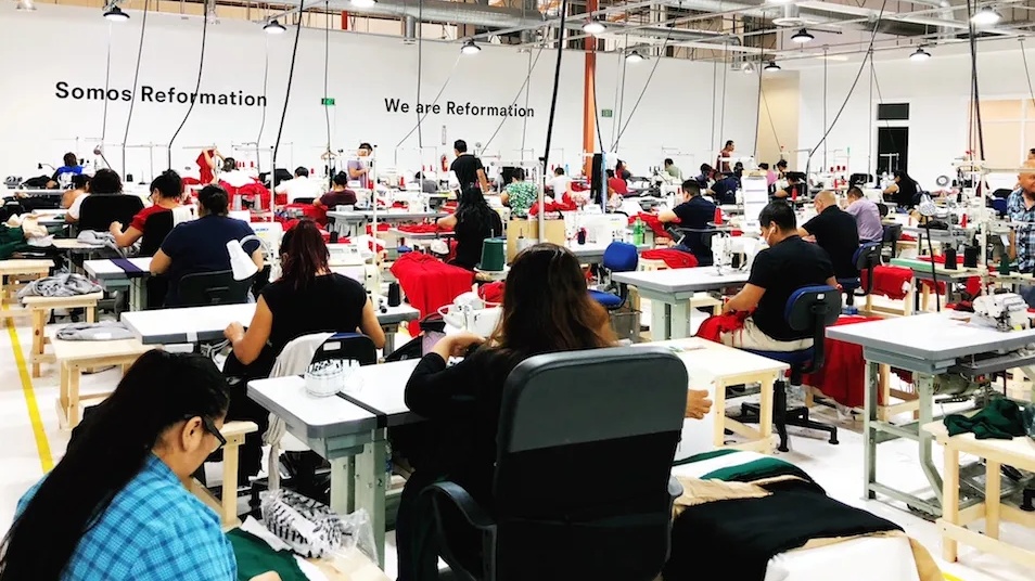
I once delivered a large batch of garments, only to find that each shipment had a slightly different shade. This triggered complaints and returns. My mistake was ignoring Pantone color number1 accuracy and neglecting a standardized color check. Resolving this taught me how crucial color cards and consistent proofs are.
You can improve color consistency by locking the correct Pantone color system, confirming target shades under standardized light conditions, and attaching signed color labels to each production stage. This builds a clear reference from proofing to bulk goods. Visual mismatches drop dramatically when everyone has the same baseline: a physical color card.
I recall the panic of sorting through crates of mismatched garments. That experience made me focus on systematic color checks. Let’s explore why color difference control2 is essential, how to use Pantone color numbers effectively, and the practical steps for ensuring every shipment matches client expectations.
Why is color difference control the core link of bulk delivery of clothing?
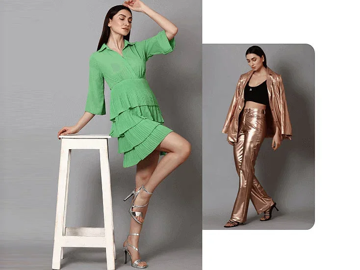
Color is the first thing customers notice. One mismatched tone can ruin a garment’s appeal. Factories deal with variations from dye lots, different lighting conditions, and machine calibrations. A strict color control process bridges these gaps and safeguards brand image.
Reliable color matching elevates quality and brand trust. When color differences occur, returns rise, marketing photos look off, and loyal buyers lose confidence. Sources of mismatches often appear in subtle places, like inconsistent light sources or overlooked fabric differences. Addressing these issues helps you maintain design integrity and meet expectations.
 Swatch Review
What impact does color inconsistency have on brand image and customer experience?
It undermines a customer’s trust. If shoppers receive goods that differ from advertised shades, dissatisfaction grows. Over time, repeated color mistakes tarnish a brand’s reputation, leading to negative reviews or unsellable stock.
What are the common sources of color difference from proofing to bulk goods?
I see issues with uneven dyeing, unmonitored machine calibration, inconsistent lighting at inspection, and ignoring the exact Pantone code. Also, inadequate communication between the designer, dye house, and finishing teams often magnifies color shifts.
How to lock the "target color value" of Pantone color number in the proofing stage?
I realized that simply stating a Pantone name or code doesn’t guarantee uniformity. Pantone has multiple systems—TCX, TPX, C, etc.—each with slight variations. Using the correct system aligned with the garment’s fabric is crucial. Otherwise, you risk a mismatch from the start.
Choose the right Pantone version for your material: TCX or TPX for textiles, C or U for paper or coated references. Document it clearly in a proofing confirmation table. Include the intended light source—like D65 or store lighting. By specifying color code, fabric type, and viewing conditions, you eliminate guesswork for every stage.
What is Pantone TCX/TPX/C color system? What are the consequences of choosing the wrong version?
TCX and TPX are textile-based references, while Pantone C or U references are for coated or uncoated paper. Using a paper reference for fabric can result in dull or off-tones because the reflection properties differ. Always pick the system designed for textiles to avoid misinterpretation.
How to accurately mark "color number + material + light source conditions" in the proofing confirmation table?
I list the precise Pantone code (e.g., TPX 15-3122), the fabric composition (e.g., 100% cotton), and the inspection light environment (e.g., D65 daylight). This data appears on a color confirmation sheet, signed by both the client and production teams to ensure full agreement.
Practical process of color card proofreading: applicable to fabrics, printing, and embroidery?
Physical color cards act as a shared reference. When production staff and QC teams compare the same swatch under a standardized light box, they see identical references. This consistency helps whether you’re checking dyed fabric, printed designs, or embroidered threads.
To proof color, place your sample beside the Pantone card under a neutral light source. Angle the fabric to avoid glare or shadows. Ensure the sample is clean and flat, so reflection changes don’t mislead your comparison. For printing or embroidery, apply the same steps. Clear, repeatable methods lower color disputes.
How to use physical Pantone color cards to compare proofs under standard light sources?
Position the color card and sample in a color assessment cabinet set to D65 or relevant light. View them at a consistent angle. If they appear the same under that environment, you record a pass. Re-check if any difference arises in secondary lighting conditions, like store or fluorescent light.
What angles, fabric conditions, and reflection problems should be paid attention to when matching color cards?
Avoid steep angles or direct overhead glare. Smooth the fabric to remove wrinkles. Check for lint or dust that alters perceived color. If the surface is glossy, tilt slightly to reduce reflective hotspots. Consistency in viewing helps achieve accurate color matching.
How to standardize color difference responsibilities and processes through "color matching labels3 + signature confirmation"?
When color mismatches happened, teams argued over who caused it. We needed a single document that clearly indicated each party’s approval. Color matching labels and sign-offs clarified accountability, so no one could say they didn’t know the official reference.
A color matching sheet highlights crucial data: Pantone code, sample ID, operator name, viewing conditions, and date. Each step—like lab dips or print samples—gets a label. The customer or brand signs off to confirm acceptance. Storing the signed color card or scanning it prevents confusion if disputes arise later.
How to fill in the color matching sheet? Recommended fields: color number, sample number, operator, light source, environmental description
I always include date and version control. For instance, “Lab Dip #2, Pantone TPX 17-1502, tested under D65, observed by John.” I note “Accepted” or “Rejected” status. If accepted, the brand rep’s signature finalizes it. This detailed record ties each color step to a clear reference.
How to keep the color card after the customer confirms it? Is it necessary to scan the record digitally?
Store the physical card in a labeled folder for future reference. I also recommend scanning or photographing it—label, date, signatures, everything. Digital backups help when physical items fade over time or are misplaced.
From proofing to bulk goods: control suggestions for improving color consistency?
Even with careful proofing, the real test comes in bulk production. Fabrics from multiple rolls or suppliers can deviate. Make sure the first pieces out of the production line match your confirmed color card. This early check saves you from discovering massive color mismatches in the final packing stage.
Insist that the initial bulk run is visually compared against the original color swatch or proof. Spot check mid-batch to confirm consistency. Establish clear color difference tolerance with each supplier, especially if multiple factories handle separate components. Keep a recorded sample from each run in case disputes arise months later.
Must the first bulk goods be checked and confirmed with the color card at the same time?
Doing so immediately flags any dye-lot problems or machine calibrations drifting off spec. If there’s a minor discrepancy, you can correct it before mass production continues. Late detection can force expensive reworks or lost time.
How to control the color difference standard between different batches/fabric suppliers?
Set a maximum ΔE tolerance if you use a spectrophotometer, or define a visual “slight shift” range with physical swatches. Ensure every supplier references the same color card. If a new supplier can’t match it, request a lab dip or sample before they proceed with bulk dyeing.
Practical diagram: proofing vs color card vs first bulk goods, three-way comparison example?
Pictures speak volumes. When I place the sample swatch, Pantone card, and first bulk panel side by side, everyone sees the consistency standard. Minor color shifts might be acceptable, but major casts or differences call for a correction. Visual evidence speeds up decision-making.
In a real scenario, I lay the color card (Pantone code) next to the approved lab dip and the actual production fabric. Under the same light, I snap a reference photo. If the fabric matches within an acceptable margin, we proceed. If it’s obviously off, we fix it quickly—no need for lengthy debate.
Provide a real color matching scene diagram (sample cloth + color card + batch cloth) to explain the consistency standard
Imagine a lined-up display:
- Far left: Pantone TPX swatch labeled “Target: PANTONE TPX 15-3420.”
- Middle: Sample cloth from proofing, labeled “Approved Lab Dip.”
- Right: Bulk fabric piece labeled “First Production Run.”
Visually, they should appear nearly identical under uniform lighting.
Analyze the actual case: What kind of color cast is an acceptable error? What needs to be reworked?
A slight deviation—less than ΔE 1 or 2—may be acceptable, especially under normal store lighting. Bluish or greenish casts that diverge noticeably from the reference require re-dyeing or finishing adjustments. Ultimately, the brand or client sets these tolerance levels.
Conclusion
By combining Pantone color codes, physical color cards, and a consistent checking process, I prevent costly color mismatches. Clear documentation and timely comparisons help factories and brands deliver uniform, high-quality garments that match the approved shade every time.
-
Understanding Pantone color number accuracy is vital for maintaining color consistency in garment production, ensuring customer satisfaction and brand integrity. ↩
-
Exploring color difference control can reveal its critical role in enhancing product quality and maintaining customer trust in the fashion industry. ↩
-
Learning about color matching labels can streamline production processes and clarify accountability, reducing color mismatch disputes. ↩