Skip to content
We often admire brands that look expensive at first glance—without even seeing a logo. That "light luxury" feeling isn’t magic. It’s design logic.
Creating a sense of light luxury1 starts from selecting the right materials, designing with balance, and paying attention to the smallest accessories. All these layers together form a consistent texture perception2 that makes a brand look refined and valuable.
I once had a buyer comment, “Your dress looks expensive, even without a label.” That made me realize—true light luxury is a language of materials, not logos.
What exactly is "light luxury"? Brand sense is not expensive, but "details have logic"?
We keep hearing "light luxury" in fashion. But what does it really mean?
Light luxury isn’t about being costly. It’s about using simple, smart details to create elegance and restraint.
 Elegant Satin Coat
Why do users pay more and more attention to "texture" rather than "logo"? What are the core keywords of light luxury definition?
More customers are shopping with their eyes and hands, not just their minds. Texture is now more persuasive than logos.
The core of light luxury includes subtlety, harmony, and control. Words like "natural," "refined," "balanced," and "minimal" are often tied to it.
We can’t fake this feeling. Every touch point—from fabric to finish—must speak the same design language.
"Looking high-end" is actually a kind of information communication: color, material, and proportion are indispensable
The impression of "luxury" forms in seconds. And that’s all about how information is visually and tactilely transmitted.
Material softness, fabric sheen, color harmony, and fit all send clear visual signals to the brain: This is quality.
| Design Element | Visual Message |
|---|---|
| Matte Texture | Calm, minimal |
| Subtle Sheen | Refined, rich |
| Soft Drape | Effortless, fluid |
| Neat Seams | Precision, care |
Material selection determines the brand tone: the sense of high-end is foreshadowed from the fabric
People can feel "luxury" before they even try on a garment. That’s the power of fabric.
Material is the foundation of texture. Choosing high-quality fabrics sets the tone for how the entire brand is perceived.
What are the commonly used fabrics for light luxury brands? The difference in the tonality of acetate, Tencel, silk blend, and eco-friendly jacquard?
Not all expensive fabrics look luxurious. And not all affordable ones feel cheap.
Light luxury often uses acetate for sheen, Tencel for flow, silk blends for balance, and eco-jacquard for structure with conscience.
| Fabric | Tone it Sets |
|---|---|
| Acetate | Cool, glossy, sleek |
| Tencel | Soft, drapey, relaxed |
| Silk Blend | Balanced, graceful |
| Eco-Jacquard | Structural, eco-smart |
How to build the "first sense" of light luxury with four dimensions of material selection3 logic: weight, gloss, texture, and drape?
I always evaluate a fabric in my hand before imagining it on the body.
Weight adds value. Gloss adds refinement. Texture adds identity. Drape adds movement. Together, they create “the first sense.”
Material Evaluation Checklist:
- Weight: Is it substantial without being stiff?
- Gloss: Does it reflect light softly, not like plastic?
- Texture: Is it uniform or deliberately unique?
- Drape: Does it move with ease?
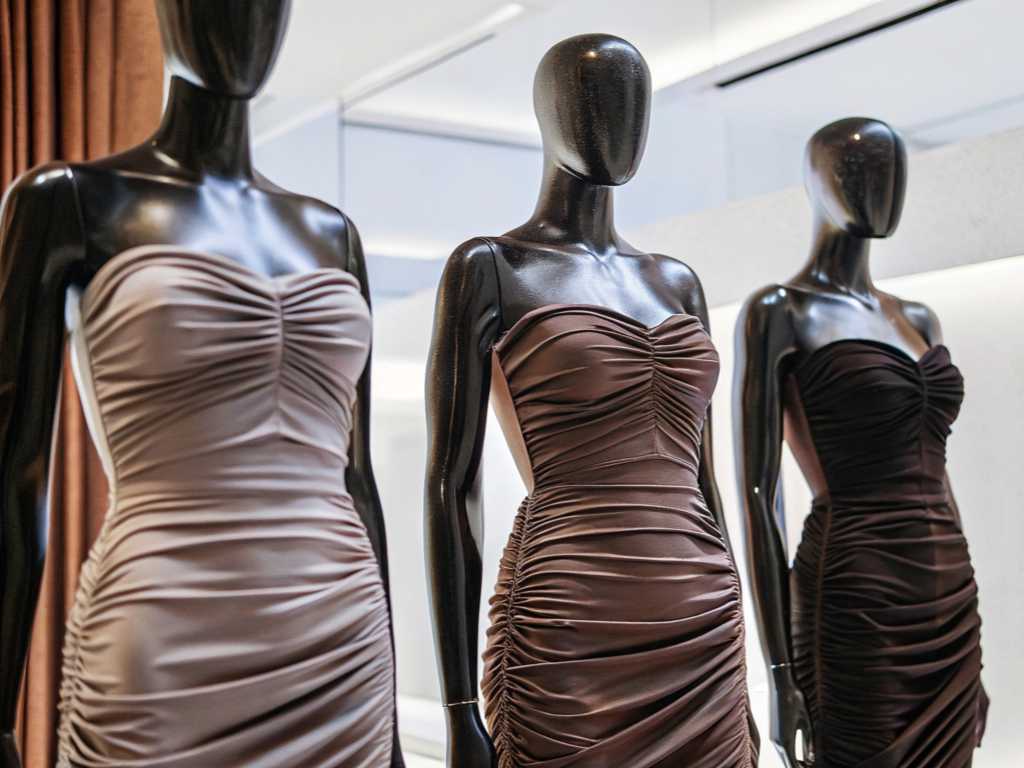
Accessories are "texture amplifiers": the brand aesthetic embodiment of hardware, wiring, and edge craftsmanship
Accessories are often overlooked, but they’re the secret agents of brand value.
Refined zippers, custom buttons, and clean edges quietly confirm the quality of the garment.
A cheap button can ruin an expensive dress. A smooth zipper can elevate a simple design.
Luxury hides in small places. That’s why real attention goes into parts that are rarely noticed—but always felt.
| Hidden Elements | What They Signal |
|---|---|
| Button Quality | Precision, care |
| Lining Material | Comfort, value |
| Zipper Track | Smoothness, ease |
| Stitching Lines | Control, detail |
Minimalism doesn’t mean plain. It means thoughtful.
Minimalist brands don’t show off. Instead, they design buttons, hooks, and seams to blend in—but never go unnoticed.
Tips I use:
- Choose tone-on-tone stitching.
- Hide closures within seams.
- Use matte-finished metal hardware.
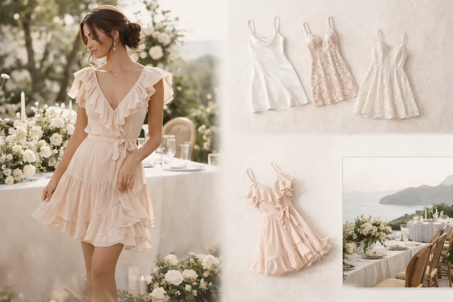
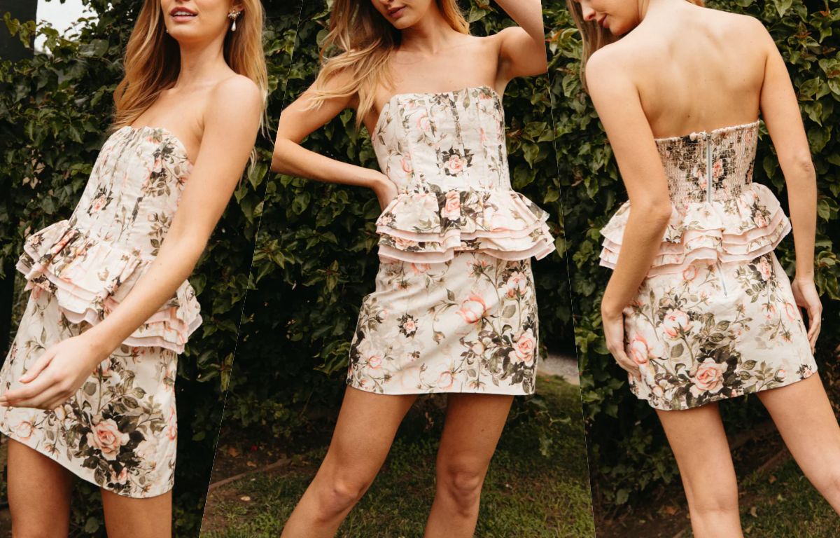
Color + structural proportion = sensory luxury: style control in light luxury design
A well-cut dress in the wrong color doesn’t feel premium. And vice versa.
Color and proportion are the emotional triggers in light luxury design. They define the mood and the style balance.
Low saturation is luxury? Or does the material determine the color expression?
Color isn’t just about hue. It’s about how the fabric shows that hue.
Low-saturation colors work well with high-end textures because they absorb and reflect light softly.
Fabric x Color Matrix
| Fabric | Ideal Colors |
|---|---|
| Silk Blend | Off-white, mauve, navy |
| Acetate | Dusty rose, olive, beige |
| Linen Mix | Cream, stone, khaki |
Which type of version is most likely to create a "luxury but not exaggerated" texture perception?
The right version is quiet, confident, and fits naturally.
Relaxed tailoring, soft shoulder lines, and balanced volume create a light luxury silhouette.
| Style Element | Luxury Signal |
|---|---|
| Draped Dresses | Movement |
| Cinched Waist | Structure |
| A-line Hem | Femininity |
| Wide Sleeves | Elegance |
Conclusion
Luxury isn’t loud. It’s layered. From fabric to zipper, every detail speaks.
-
Explore this link to understand the essence of light luxury and how it transcends mere cost, focusing on elegance and detail. ↩
-
Learn about the importance of texture perception in creating a luxurious feel and how it influences consumer choices. ↩
-
Discover how the right materials can elevate a brand’s image and create a lasting impression of quality and luxury. ↩