Skip to content
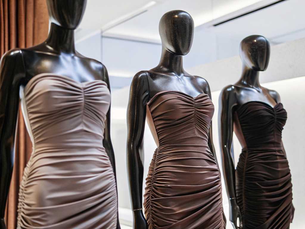
I see many buyers worry about inconsistent dress colors. They feel uneasy when the final product doesn’t match their expectations. I understand this pain. I believe there is a clear way to fix it. I want to share my experiences, so we can solve color issues together.
Color difference can be controlled by improving fabric pretreatment1, standardizing printing procedures, and setting unified color benchmarks. I follow strict proofing steps, choose consistent inks, and track production in real time. This helps me create dresses with stable, accurate colors.
I once lost a big order because the final dresses looked different from the approved sample. That moment changed my attitude toward color control. I learned to refine every detail, from fabric selection to monitoring production. I want to help others avoid the same mistake.
What are the common color difference problems of printed dresses? How to accurately identify and classify?
I know many buyers see clear mismatches in color from sample to bulk production. They also encounter uneven tones in different parts of the garment. I often categorize these issues by source and severity to pinpoint whether the problem lies with the fabric, ink, or machine.
Common color difference2 problems include mismatched batch shades, patchy tones in large surfaces, and subtle shifts under different lighting. I identify them by comparing approved swatches with final garments under consistent light and using color measurement tools. This helps me classify issues before moving to solutions.

How is color difference caused? What are the factors that affect printing consistency?
I believe color shifts can stem from uneven fabric absorption, variations in ink quality, and fluctuating machine settings. Sometimes, humidity and temperature also affect print penetration. Below is a simple table I use to organize major factors:
| Factor | Impact on Color | Notes |
|---|---|---|
| Fabric Composition | Absorption rate varies | Natural vs. synthetic fibers differ |
| Ink Viscosity | Affects saturation | Must be carefully controlled |
| Machine Calibration | Alters color alignment | Regular checks needed |
| Temperature & Humidity | Influences drying and color set | Consistent conditions recommended |
I test these factors by running trials on a small scale. Then I compare the results to confirm consistency.
What types of color difference do users often complain about? How can clothing companies prevent it?
I categorize complaints into hue discrepancies (wrong color family) and saturation problems (washed-out or too vibrant). Some people also see uneven color on seams. To prevent these issues, I propose:
- Consistent fabric sourcing.
- Trained technicians to handle ink mixing.
- Regular machine calibration.
- Thorough sampling before mass production.
Key links affecting color difference: detailed explanation of fabric pretreatment and printing process?
I focus on precise fabric preparation and proper ink application to keep colors accurate. Fabric pretreatment removes impurities, so the fabric absorbs ink more uniformly. Proper printing processes help maintain color accuracy at scale.
The main links include fabric desizing and washing, controlled drying, correct printing method choice, and post-print checks. I find that each step helps lock in the desired color. I oversee every detail to ensure uniform outcomes.
What color difference problems will be caused by improper fabric pretreatment? How to improve?
I see issues like patchy prints and dull colors when fabric pretreatment is incomplete. Below is a checklist I follow:
- Desizing: Remove starch residues.
- Washing: Eliminate oils and dust.
- Drying: Ensure even moisture content.
| Pretreatment Step | Common Pitfall | Improvement Tip |
|---|---|---|
| Desizing | Residual starch causes blotch | Use proper enzymes, check thoroughly |
| Washing | Chemical remains dull color | Rinse fully and test pH levels |
| Drying | Uneven dryness creates spots | Calibrate temperature, measure fabric moisture |
When I focus on these details, I reduce the chance of unexpected color shifts during printing.
What are the differences in color difference control between thermal transfer, digital printing and screen printing?
I learned that each printing method has unique strengths and weaknesses:
- Thermal Transfer: Usually has bright colors, but color might vary on different fabrics.
- Digital Printing: Offers high detail, though machine calibration and ink formula strongly influence color stability.
- Screen Printing: Delivers vibrant results for large areas, but screens must be uniform and well-maintained.
I select the method based on the dress design and desired color accuracy.
How to control the color difference of printed dresses from the source? A full analysis of practical methods?
I think early-stage color management is crucial. I believe selecting stable fabrics and rigorous color testing in sample stages minimize errors. I also maintain close communication between design and production teams to keep everyone aligned.
Controlling color difference begins with fabric choices, standard proofing procedures, and advanced monitoring systems. I use consistent dyes, regularly calibrate machines, and create reference swatches. These steps guide me to avoid major color surprises.
Can choosing the right fabric material reduce color difference? What are the recommendations?
From my observation, fabrics with stable structures hold color better. Cotton blends and certain polyesters are reliable. I prefer materials with tested shrinkage and dye uptake. That way, I avoid unpredictable fades. Here’s a table of my usual picks:
| Fabric Type | Benefits | Drawbacks |
|---|---|---|
| 100% Cotton | Good ink absorption | Might shrink after washing |
| Polyester Blend | Vibrant color retention | Static buildup can affect print |
| Rayon/Viscose | Soft drape, clear prints | Needs careful wash care |
I check each fabric’s track record with standard dyes before starting large orders.
How to accurately adjust the color in the printing proofing stage? Analysis of standard processes?
During proofing, I do a color test run to match the requested Pantone or sample swatch. I adjust ink formulas and printing parameters step by step. I also check the fabric under multiple lighting conditions. By comparing color readings with a colorimeter, I see if the final output matches the original design goal.
How to unify color standards in the mass production of printed dresses?
I use standardized color references like Pantone cards or color sample cloth. I believe these tools create uniform checkpoints for everyone, from the design room to factory floors. They help me unify color expectations and reduce miscommunication between multiple departments.
Adopting official color scales, consistent lighting conditions, and calibrated production lines ensures that every dress looks as intended. I share these standardized references with my team to keep everyone on the same page.
How can Pantone color cards or color sample cloth effectively assist in batch printing control?
I rely on Pantone cards to set precise color targets. I compare print outcomes to these cards at every stage. When variations appear, I adjust ink or machine settings immediately. Color sample cloth also helps me simulate final results, so I can see potential shifts before mass production starts.
How can factories track and correct color differences through production monitoring systems?
I use real-time monitoring to catch color deviations. I integrate inline color sensors on the production line that alert me if color drifts beyond a preset tolerance. A dashboard shows me data from multiple checkpoints. When I see deviations, I pause production, correct the ink mix or machine calibration, then resume.
Conclusion
I believe controlling color difference is a process that starts early and requires ongoing checks. With the right methods, we can achieve consistent colors that delight customers.
-
Learn about the critical role of fabric pretreatment in achieving accurate color results in printing, which can significantly enhance your production quality. ↩
-
Explore this resource to understand proven techniques for managing color differences in printed fabrics, ensuring quality and consistency in your products. ↩