
How to Review Color Accuracy in Women's Fashion Production: From Lab Dip to Bulk Garments

Your trusted Women’s Apparel Manufacturer from China

Color accuracy is one of those production details that looks simple until money is on the table. A buyer may approve a deep wine satin dress on a screen, love the first lab dip in the office, confirm the PP sample under showroom lighting, and still receive bulk garments that look slightly too red, too dull, or too yellow after packing. The problem is not always carelessness. Color changes with fiber content, dyeing method, fabric surface, light source, finishing, print technique, trims, lining, and even the way garments are folded in a carton.
To review color accuracy in women’s fashion production, compare a clear color standard against lab dips, bulk fabric, trims, prints, and finished garments under controlled light. The best process combines approved references, light box review, Delta E support, fabric-specific tolerance, bulk roll inspection, and documented color records.
The real risk is not one imperfect shade. The real risk is discovering the problem too late, after cutting, sewing, pressing, labeling, and packing. A small shade drift on a black jersey dress may pass unnoticed. The same drift on champagne satin, ivory lace, or a multi-color resort print can become a return, a chargeback, or a lost reorder. That is why experienced fashion brands treat color review as a production control system, not a last-minute visual check.
What Is Color Accuracy?
Color accuracy in apparel means how closely a fabric, trim, print, or finished garment matches the approved color standard. In women’s fashion production, it should be judged against a physical reference under controlled lighting, not only by screen images or phone photos. A reliable review checks hue, depth, brightness, surface effect, and consistency from lab dip to bulk garments.
Color in Real Garments
Color accuracy in fashion is never just a flat color code. It is the way color appears on a real material, in a real garment, under real light, after cutting, sewing, pressing, and packing. A rose pink satin dress, a rose pink mesh overlay, and a rose pink rib-knit bodycon dress may all start from a similar target shade, but the final look can be noticeably different because each fabric reflects and absorbs light differently.
For buyers, the important question is not simply, “Does this match the Pantone?” A better question is, “Does this color match the approved standard in the same material, construction, and selling condition?” A fabric swatch may look acceptable when flat, but the color can become lighter when stretched, darker when layered, or shinier after pressing.
This is why color review should follow the garment’s actual use. If the dress has lining, review the shell and lining together. If it has ruched mesh, review the color in both relaxed and stretched areas. If it is a satin evening dress, check the color from several angles because shine can change the visual result.
Accuracy vs Matching
Color matching is the process of trying to make a sample close to a reference. Color accuracy is the result of whether the final approved item truly stays close enough through production. The difference sounds small, but it matters when a brand moves from development to bulk orders.
A factory may match a lab dip well, but bulk fabric can still shift. A fabric mill may dye the shell fabric correctly, but the thread, zipper tape, lining, or lace may come from a different supplier and appear slightly off. A print strike-off may look right, but the final production print may lose saturation after finishing. That means color accuracy must be reviewed as a chain, not a single event.
For fashion brands, the goal is not mathematical perfection in every case. The goal is commercial consistency. A customer buying a navy satin bridesmaid dress expects the shade to match the product photo, the collection story, and the other dresses in the same order. A slight technical difference may pass, but a visible mismatch on the body or in photos can damage trust.
Why Screens Mislead
Screens are useful for early design discussion, but they are weak color approval tools. One buyer may review a color on a MacBook, another on a phone, and the supplier may open the same image on an office monitor with a different brightness setting. Auto-correction, filters, camera exposure, white balance, and file compression can all change the color before anyone even discusses production.
A digital reference is especially risky for soft colors such as ivory, champagne, blush, nude, butter yellow, sage green, pale blue, and light lavender. These shades can shift easily under different screens. Dark colors also create problems. Black may look neutral on screen, but in fabric it can lean blue, red, green, or brown depending on dye recipe and fiber.
A screen image can guide mood, but it should not become the final production standard. For serious development, the buyer should provide a physical reference such as a Pantone textile code, fabric swatch, original sample, approved lab dip, or signed bulk fabric standard. Physical standards reduce argument, shorten approval time, and make color review much more repeatable.
Common Failure Points
Most color mistakes happen because the approval standard is unclear or because the review happens too late. A buyer sends a photo, the supplier guesses the shade, the lab dip is approved quickly, trims are selected separately, and the first full garment is not checked under controlled light until production has already moved forward. By then, correction is expensive.
Another common failure is reviewing materials separately. Shell fabric may be approved, lining may be approved, thread may be approved, and zipper may be approved, but the final garment still looks wrong when all pieces are combined. This often happens in mesh dresses, lace dresses, satin dresses, contrast topstitching, and matching sets.
Color accuracy improves when every stage has a clear checkpoint: color standard, lab dip, strike-off, trim card, bulk fabric roll, cutting lot, PP sample, inline garment, and final inspection. The earlier the problem is caught, the easier it is to correct. Once fabric is cut and sewn, color problems are no longer just color problems. They become production, delivery, cost, and relationship problems.
Which Standards Matter?
The most useful color standards in apparel are physical color references, approved lab dips, Delta E readings, light source conditions, bulk fabric standards, and brand tolerance rules. A strong standard should be clear enough for the buyer, manufacturer, fabric mill, trim supplier, and QC team to review the same color in the same way.
Physical References
A physical standard is the foundation of reliable color approval. It may be a Pantone TCX reference, a fabric swatch from the buyer, an original garment sample, an approved lab dip, an approved print strike-off, or an approved bulk fabric cutting. The key is that everyone must know which reference is the master standard.
If a buyer provides several references, the team should decide which one controls production. For example, the mood board may show direction, the Pantone code may define the color family, but the approved lab dip may become the working production standard. Without this decision, the design team, sourcing team, mill, and factory may each judge color differently.
Physical references should be labeled and stored properly. A good label includes style number, color name, fabric type, season, approval date, version number, and whether the sample is for development, bulk, or reorder use. For repeat orders, one sealed archive standard is helpful because working samples can fade, become dirty, or change after repeated handling.
Delta E Basics
Delta E is a numerical measurement of color difference between a sample and a standard. It helps reduce subjective debate, especially when buyer and manufacturer are in different countries. A lower Delta E usually means the sample is closer to the approved reference, but the number should be used with visual judgment, not as the only decision maker.
Delta E Range | Typical Apparel Meaning | Common Action |
0-1.0 | Very close difference; often hard to see visually | Usually acceptable if fabric appearance is stable |
1.0-2.0 | Slight difference; often acceptable for many commercial garments | Review under light box and confirm by fabric type |
2.0-3.0 | Noticeable risk for sensitive colors or shiny fabrics | Buyer approval or correction usually needed |
Above 3.0 | Visible difference likely in many apparel cases | Re-dip, recheck, or written exception required |
Lab Dip Standards
Lab dips are small dyed fabric samples used before bulk fabric production. They are usually submitted in several options so the buyer can choose the closest shade or request adjustment. Lab dip approval is one of the most important moments in color control because it sets the direction for bulk dyeing.
A clear lab dip review should include comments about hue, depth, and brightness. “Too yellow” is different from “too light.” “Too dull” is different from “too dark.” These words guide the dyeing team more accurately. Vague feedback such as “not right” or “make it nicer” often leads to repeated rounds and lost time.
The lab dip should be made on the correct fabric or the closest available production fabric. If the bulk fabric will be stretch satin, a lab dip on plain woven polyester may not show the same final effect. If the garment uses mesh over lining, the lab dip should be reviewed both alone and over the intended lining. A lab dip is not just a color chip; it is the first test of whether the target color can work on the actual material.
Tolerance Rules
Tolerance means how much difference is acceptable before correction is needed. In apparel, tolerance should depend on product type, fabric surface, color sensitivity, selling channel, and reorder requirements. A one-time fashion color may allow more flexibility than a brand’s core black, ivory, red, or champagne shade.
Premium ecommerce brands usually need stricter control because color differences show clearly in product photos and customer reviews. Occasionwear brands also need careful tolerance because dresses may be worn together at weddings, events, parties, graduations, or group occasions. A slight color difference between two bridesmaid dresses may be much more serious than a slight difference between two casual tops sold separately.
Tolerance should be agreed before production. The buyer and manufacturer should decide what requires a new lab dip, what can pass with written approval, what must be separated by dye lot, and what cannot be accepted. When tolerance is not defined, teams often argue after the cost has already been created.
How Do You Check Color?
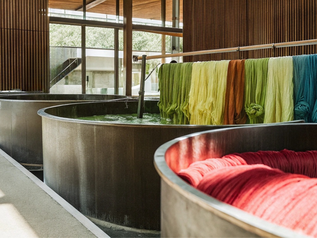
Color should be checked by comparing the sample against the approved standard under controlled lighting, ideally in a light box, with the same fabric direction, background, and viewing angle. The review should include visual assessment, measurable data where available, written comments, and approval records for lab dips, trims, bulk fabric, and finished garments.
Light Box Review
A light box helps create a stable review environment. It allows the buyer, factory, and mill to compare color under agreed lighting instead of relying on office lamps, window light, or warehouse conditions. This matters because a fabric can look correct under one light and wrong under another.
Light Source | Common Use in Apparel Review | What It Helps Reveal |
D65 daylight | General color approval and daylight comparison | Overall hue, depth, brightness |
TL84 store light | Retail and showroom condition review | Green/yellow shifts, store display risk |
CWF/U30 | Commercial indoor lighting reference | Warm or cool indoor shade change |
A light | Warm household lighting | Red/yellow shift and eveningwear appearance |
Visual Checks
Visual color review should be simple, repeatable, and honest. The reviewer should compare the sample with the master standard and comment on hue, depth, and brightness. Hue means whether the color leans red, yellow, blue, green, or another direction. Depth means whether it is lighter or darker. Brightness or chroma means whether it looks duller or more vivid.
The sample should be clean, flat, and large enough to judge. Tiny swatches can mislead, especially for prints, lace, sequin fabric, and textured materials. For garment review, the piece should be checked after pressing because wrinkles and surface tension can affect the color appearance.
Visual review should also consider selling context. A dress that looks acceptable on a fabric table may look different on a model, under photography lighting, or beside other colors in a collection. Matching sets must be checked as outfits, not as separate items. If a top and skirt are sold together, the customer will judge them together.
Metamerism Control
Metamerism occurs when two colors match under one light source but differ under another. It is common in apparel because different components often use different fibers, dye processes, or suppliers. Shell fabric, lace, lining, thread, zipper tape, elastic, labels, and buttons may not react to light the same way.
The easiest way to reduce metamerism risk is to review all visible components together under more than one light source. If a black satin dress has a black zipper, black thread, and black lining, all three should be checked beside the shell fabric. If a nude mesh dress uses lining, the mesh and lining should be reviewed as a combined visual layer.
Metamerism is not always fully avoidable, but it should be understood before bulk production. Some trims cannot be dyed to match perfectly because of material limits. In that case, the buyer should approve the closest commercial match or choose a design adjustment. The worst situation is discovering metamerism after garments are sewn, when changing trims may require unpicking, remaking, or discounting finished stock.
Approval Records
Color review without records creates problems during production and reorders. Every approval should be dated, labeled, and connected to a specific style, fabric, color, and version. This includes lab dips, strike-offs, trim cards, bulk fabric swatches, PP samples, and final garment standards.
A practical approval record should answer basic questions: What was approved? Who approved it? Which version was rejected? Under which light source was it checked? Was the approval conditional? Was a tolerance exception accepted in writing? These details prevent confusion when production moves quickly.
For repeat orders, records are even more important. A successful black bodycon dress or champagne satin slip dress may be reordered months later. If the team has no sealed standard, no bulk swatch, and no trim record, everyone must rely on memory. Memory is not a production standard. Good records reduce repeat-order risk and help keep collections consistent across multiple drops.
How Do Fabrics Affect Color?
Fabrics affect color because fiber, surface, transparency, stretch, weave, knit structure, finishing, and shine all change how color appears. The same target shade can look different on satin, mesh, lace, jersey, chiffon, sequin, or printed fabric. Color review must therefore be based on the actual production material, not only a color code.
Satin and Shine
Satin is color-sensitive because it reflects light strongly. A shade can look rich and elegant from one angle but too bright or too pale from another. This is why satin dresses in champagne, ivory, emerald, wine, navy, chocolate, blush, and silver often need careful review.
For satin, the team should check both flat fabric and garment form. A swatch may look acceptable, but once the dress is draped, cut on bias, pressed, or photographed, the shine may change the visual effect. Slip dresses, corset dresses, evening dresses, bridesmaid styles, and party minis are especially sensitive because customers notice color and shine immediately.
Satin also requires cutting direction control. If panels are cut in different directions, the garment may look like it has shade variation even when the roll is the same. For high-shine fabric, front body, back body, sleeves, straps, and waistband pieces should be cut with consistent direction unless the design intentionally uses contrast.
Mesh and Transparency
Mesh changes color because it is transparent, elastic, and often layered. A single-layer mesh swatch can look much lighter than the final garment if the style has ruching, double layers, or lining. At the same time, mesh can look darker where seams, folds, gathers, or overlaps create extra density.
Fabric Type | Color Behavior | Review Focus |
Satin | Reflective, angle-sensitive, may look lighter or shinier | Check direction, shine, pressing, panel consistency |
Mesh | Transparent, stretch-sensitive, changes over lining or skin | Review over lining and in stretched condition |
Lace | Patterned, layered, affected by base fabric | Review with lining and visible trims |
Jersey/Rib | Stretch can lighten shade on body | Check relaxed and stretched areas |
Chiffon | Sheer and layered, color deepens in gathers | Review single layer and garment layers |
Sequin | Reflects light; color changes by angle | Check under event and photo lighting |
Lace and Layering
Lace is not a simple solid surface. It has pattern, open space, thickness, raised texture, and usually a base layer underneath. This makes color review more complicated than plain fabric. Ivory lace over ivory lining may look soft and bridal, while the same lace over nude lining may look warmer and more modern.
For lace dresses, the lining color must be approved together with the lace. If the lining is too yellow, pink, or grey, it can change the whole appearance. Thread and binding also matter because they may sit directly on top of visible lace edges. A small mismatch at the neckline, straps, or hem can make the garment feel less refined.
Lace density also affects perception. Dense floral lace may look deeper than open lace in the same shade. Placement can change the result too. Lace on sleeves, bodice panels, waist inserts, and hems may each interact differently with skin or lining. For occasionwear, lace color review should always happen in garment context, not only as a loose fabric swatch.
Prints and Placement
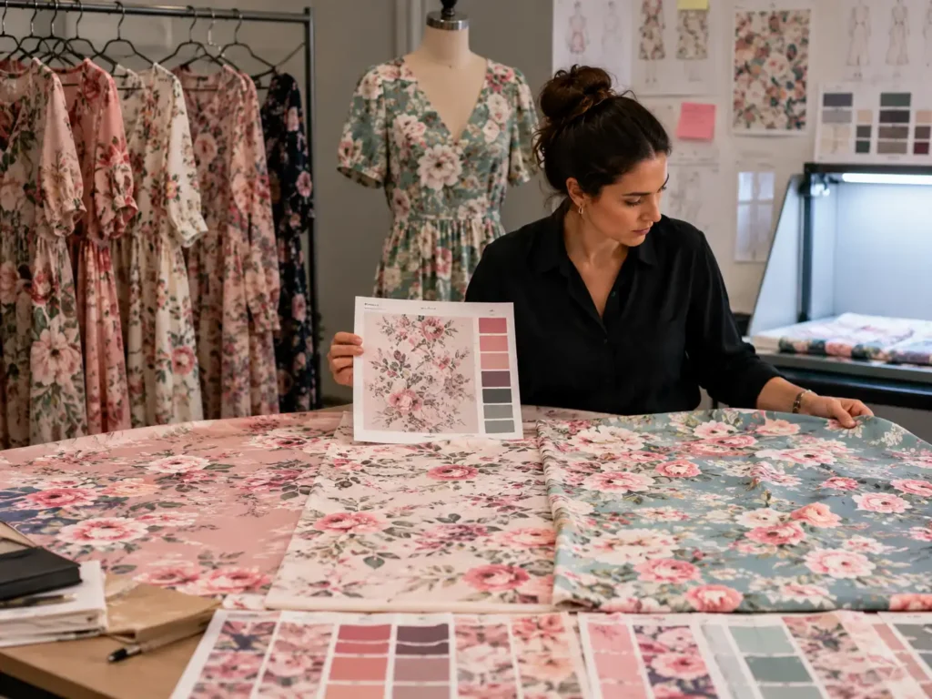
Print color accuracy includes more than matching individual colors. Scale, base fabric, ink absorption, print method, repeat, placement, and finishing all affect the result. A floral print may look bright on a screen but softer on chiffon, sharper on satin, and more muted on rayon. The same artwork can look different depending on the fabric surface.
A strike-off is essential for printed garments. It allows the buyer to check color balance, print scale, sharpness, ground color, and repeat before bulk printing. For vacation dresses, resort sets, floral maxis, and eventwear prints, the overall feeling matters as much as each color value. Customers judge the print as a whole.
Placement prints need extra care. If the design has large flowers, border prints, engineered placement, or matching top-and-skirt panels, color review must connect with cutting instructions. A print may be approved, but if placement is inconsistent, the final garment may still look wrong. For matching sets, both pieces should be checked together because the customer expects one coordinated outfit.
How Is Bulk Color Controlled?
Bulk color is controlled by checking bulk fabric before cutting, separating shade lots when needed, matching trims against shell fabric, monitoring cutting bundles, and comparing finished garments with the approved standard. The goal is to catch shade variation early, before cutting and sewing make correction expensive or impossible.
Bulk Fabric Checks
Bulk fabric approval should happen before cutting. The QC team should compare bulk roll headers with the approved standard or approved lab dip. Reviewing only one roll is not enough if the order uses multiple rolls or dye lots. Roll-to-roll variation is common in many fabrics, especially when production volume is large.
Control Point | What to Check | Practical Record |
Roll header review | Compare each roll or dye lot to approved standard | Roll number, dye lot, shade comment |
Side-to-side check | Check shade across fabric width | Pass/fail or shade band note |
End-to-end check | Check beginning, middle, and end where needed | Shade drift comment |
Cutting lot grouping | Keep similar shade rolls together | Bundle number and roll group |
Finished garment audit | Compare sewn garment to approved sample | Inspection report and photo record |
Cutting Lot Control
Cutting control is one of the most practical ways to protect color accuracy. Even if bulk fabric has slight acceptable variation, poor cutting management can turn it into visible garment defects. If front and back panels come from different shade groups, the garment may look uneven. If left and right panels differ, customers may see the problem immediately.
Cutting teams should keep each garment’s main panels within the same shade group whenever possible. This is especially important for solid satin dresses, bodycon jersey dresses, black styles, pale colors, matching sets, and multi-panel skirts. Bundle labels should identify style, color, size, quantity, roll group, and cut number.
Good bundle control must continue into sewing. If bundles are mixed during sewing, the cutting team’s shade separation is wasted. Each production line should keep shade groups organized from cutting to sewing to finishing. This kind of basic discipline often determines whether bulk garments look consistent at final inspection.
Trim Matching
Trims should be reviewed with the shell fabric before bulk sewing. Thread, zipper tape, lining, buttons, elastic, binding, lace edge, drawcord, eyelets, and labels can all affect the finished appearance. Even small trim mismatches can be obvious on clean designs.
Visible trims need tighter control than hidden trims. A zipper tape on a fitted mini dress, thread on satin seams, binding on a lace neckline, or lining under sheer mesh should be reviewed carefully. Hidden inside seams may allow more flexibility if they do not affect customer-facing appearance.
Trim materials may not match perfectly because they use different fibers and dye processes. Polyester shell fabric, nylon lace, cotton thread, resin buttons, and metal hardware all behave differently. The key is to decide what must match exactly, what can be tonally close, and what should be intentionally contrast. Written approval avoids argument later.
Finished Garment Review
Finished garment review is the final chance to confirm whether all earlier color decisions work together. The inspector should compare the garment with the approved PP sample, bulk standard, or color card under controlled light. The review should include shell fabric, lining, visible trims, print placement, panel consistency, and overall commercial appearance.
Garments should be checked after pressing because pressing can change shine, especially on satin, velvet, and synthetic fabrics. They should also be checked in a natural garment position, not only folded. A dress may look fine in a stack but show shade differences when opened fully.
For multi-size and multi-batch orders, samples from different sizes, bundles, and production times should be reviewed. If only one top sample is checked, problems in later production may be missed. For large orders, a practical inspection can include first pieces, inline pieces, and final packed samples. The goal is not to inspect color endlessly, but to check enough points to catch production drift before shipment.
How Should Brands Work With Manufacturers?
Brands should work with manufacturers by providing clear color references, tech packs, fabric requirements, quantity plans, and approval rules before sampling starts. The best results come from shared records, physical standards, precise feedback, golden samples, and agreed review checkpoints from lab dip to finished bulk garments.
What to Provide
The stronger the input, the better the color result. A brand should provide a physical color reference whenever possible, such as a Pantone TCX reference, original swatch, approved sample, or previous bulk fabric. A digital image can help show direction, but it should not be the only color standard for production.
The buyer should also provide fabric expectations. A color target on matte crepe may not behave the same on stretch satin, lace, mesh, chiffon, or rib knit. If the brand is open to fabric alternatives, that should be discussed early because fabric changes can shift color appearance and cost.
For a smooth start, the development package should include style number, color name, target material, order quantity, size range, market, delivery window, trim requirements, print artwork if needed, and any color tolerance rules. When a manufacturer understands both the look and the production plan, it can guide the buyer more realistically.
How to Give Feedback
Color feedback should be short, specific, and useful. “Too dark” gives a clear direction. “Too yellow” gives a clear direction. “Not premium enough” does not. The best comments describe whether the sample needs adjustment in hue, depth, or brightness.
For lab dips, feedback may look like this: “Option B is closest, but slightly too red under D65. Please reduce red tone and keep the same depth.” For bulk fabric, it may be: “Rolls 1-5 are acceptable; roll 6 is visibly darker and should not be mixed in the same garment.” For trims, it may be: “Zipper tape is too blue against shell fabric; please find a warmer black.”
Feedback should also be documented with photos when useful. If photos are used, the standard and sample should be in the same frame under controlled light. Photos should support written comments, not replace them. Clear feedback reduces sample rounds and keeps launch schedules under control.
Golden Sample Use
A golden sample is the approved reference used by production and QC. It may be an approved PP sample, approved bulk fabric swatch, approved trim card, or full garment. For color-sensitive items, a full garment is often the most useful because it shows how shell fabric, lining, trims, construction, and finishing work together.
The golden sample should be labeled clearly and protected. It should not be handled casually by multiple teams without control. If the production line needs a working sample, it is wise to keep a sealed archive standard separately. The archive standard can be used later if there is a dispute or reorder.
For complex fashion items, the golden sample should include the real production details: lining under mesh, thread on satin, lace over base fabric, print placement, zipper color, label placement, and final pressing effect. A swatch alone may not be enough. The closer the golden sample is to the actual selling garment, the more useful it becomes.
Reorder Records
Reorder color control depends on records. If a style sells well, the brand may reorder quickly, sometimes months after the first bulk shipment. Without records, the team may struggle to repeat the same shade, especially if the original fabric lot is no longer available.
Good reorder records include approved lab dip, bulk fabric swatch, trim card, PP sample photos, fabric supplier details, composition, dye lot, print file version, color comments, and final inspection notes. These records help the manufacturer restart production with less guessing.
For fashion brands that launch seasonal collections, repeat bestsellers, or run multiple drops of the same color family, color records become a long-term asset. They reduce communication time, prevent repeated lab dip cycles, and protect product consistency across campaigns, photoshoots, and customer orders. In practical production, the brands that control records usually control color better.

Review Color Before It Becomes a Production Problem
Color accuracy is not about being overly picky. It is about protecting sell-through, customer trust, product photography, reorder consistency, and brand value. In women’s fashion, color is emotional. A customer may not know the technical difference between hue, chroma, and Delta E, but she can feel when a champagne satin dress looks cheap, when a lace panel looks mismatched, or when a matching set does not really match.
The best review process is practical: start with a physical color standard, approve lab dips carefully, check fabric under controlled light, use Delta E as supporting data, review trims beside shell fabric, control cutting lots, inspect finished garments, and keep records for future reorders. This is especially important for satin dresses, mesh dresses, lace dresses, sequin dresses, printed dresses, partywear, occasionwear, resortwear, bodycon styles, jumpsuits, and matching sets.
Jinfeng Apparel supports custom women’s fashion manufacturing from development, fabric sourcing, sampling, bulk production, QC, private-label packaging, and export delivery for global fashion brands and mid-to-large apparel clients. If your brand is developing a color-sensitive dress collection, send your tech pack, Pantone reference, fabric swatch, original sample, or product direction. The team can help review fabric options, sample development, lab dip communication, trim matching, and bulk production planning before color becomes an expensive problem.
Share This Article :

Jerry Lee
Categories

Latest blogs
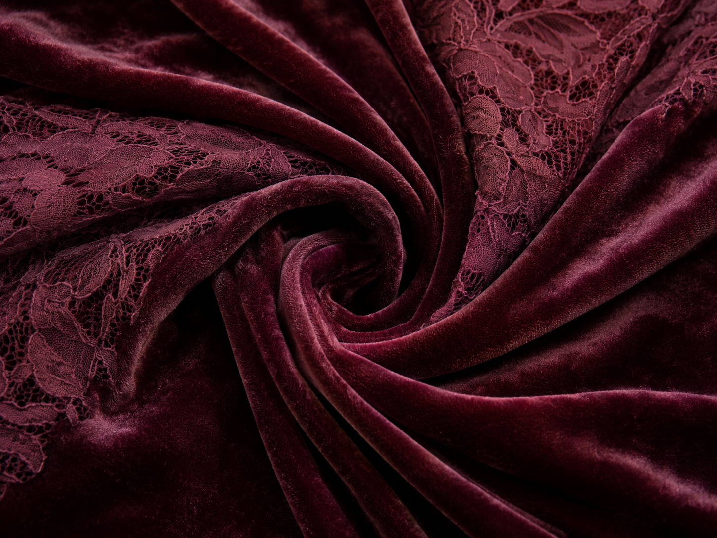
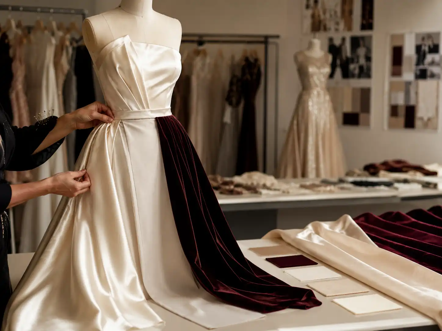

Table of Contents
Here, developing your OEM/ODM private label clothing collection is no longer a challenge—it’s an excellent opportunity to bring your creative vision to life.